Losing count of Doomsday
The Doomsday Clock is making the news today: because of the growing nuclear threat and continued denial of global warming, scientists say we are "five minutes from Doomsday".

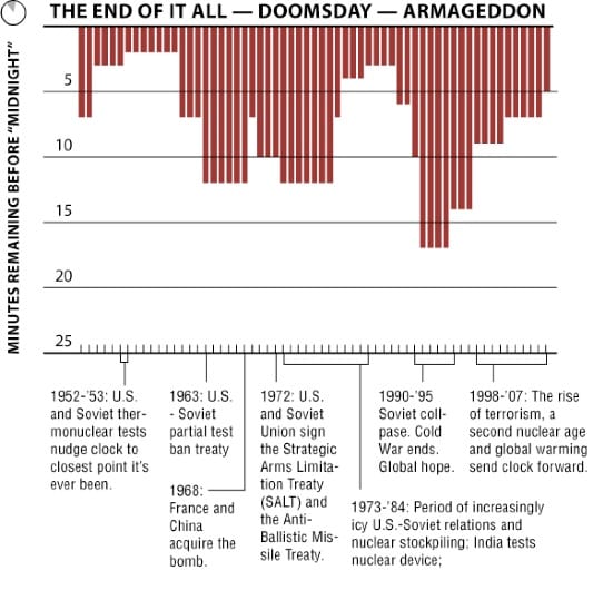
This graph traces the movement of the clock's hand over the last few decades. (I think it appeared on the New York Times website but I cannot find it now.)
The little tickmarks are superfluous, and the thin white borders between red columns serve only to make us dizzy. As shown below, a line chart is much easier on the eyes.

Now, a question for the scientists: Why the clock analogy? Does it reflect a kind of fatalism that we can never be more than 60 minutes away from Armageddon? How many minutes were we from Doomsday two hours ago?


