Lost in complexity
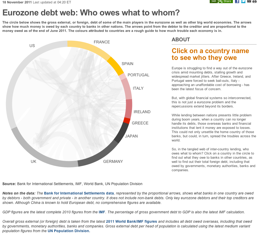
Felix Salmon (link) and others linked to this BBC News graphic about European debt recently.

***
At first sight, the use of arrows inside a ring, enhanced by an interactive filter by country, seems to be an inspired idea.
Then, I started clicking. Here is the German view.

According to the paragraph beneath the headline, the arrows show how much money is owed by each country to banks in other nations. So, it appears that German banks have lentborrowed about equal amounts tofrom France and Italy, and also good amounts tofrom the U.S., the U.K. and Japan. And German banks would be affected if these debtors were to default.
Now, take a look at the right column where BBC tells us "The biggest European economy is exposed to Greek, Irish and Portuguese, but mostly, Spanish debt." Say what?
Much more important than appearance, the designer must ensure that the data and conclusions make sense. Here, the chart doesn't support the discussion.
***
See also my previous post about Europe debt.


