Messing with expectations
Kaiser reads a map of gas surcharges.
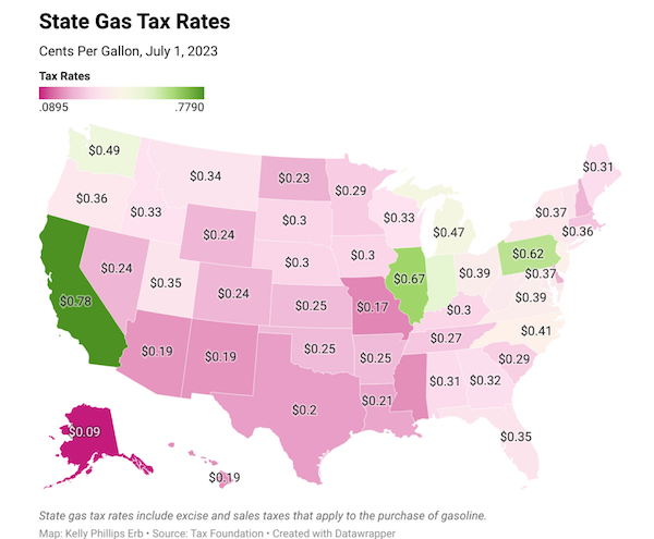
A co-worker sent me to the above map, found in Forbes.
It shows the amount of state tax surcharge per gallon of gas in the U.S. And it's got one of the most common issues found in choropleth maps - the color scheme runs opposite to reader expectations.
Typically, if we see a red-green color scale, we would expect red to represent large numbers and green, small numbers. This map reverses the typical setup: California, the state with the heftiest gas tax, is shown green.
I know, I know - if we apply the typical color scheme, California would bleed red, and it's a blue state, damn it.
The solution is to avoid the red color. Just don't use red or blue.

There is no need to use two colors either.
***
A few minor fixes. Given that all dollar amounts on the map are shown to two decimal places, the legend labels should also be shown to 2 decimal places, and with dollar signs.

The subtitle should read "Dollars per gallon" instead of "Cents per gallon". Alternatively, keep "Cents per gallon" but convert all data labels into cents.
Some of the states are missing data labels.
***
I recast this as a small-multiples by categorizing states into four subgroups.

With this change, one can almost justify using maps because there is sort of a spatial pattern.