More questions than participants
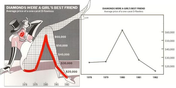
This post is a companion to my Junk Charts post on why we can't trust the research which purportedly showed that USA-Today chartjunk is "more useful" than Tuftian plain graphics. Here is an example of the two chart types they compared:

In this post, I discuss how to read a paper such as this that describes a statistical experiment, and evaluate its validity.
***
First, note the sample size. They only interviewed 20 participants. This is the first big sign of trouble. Daniel Kahneman calls this "law of small numbers", the fallacy of generalizing limited information from small samples. For a "painless" experiment of this sort in which subjects are just asked to read a bunch of charts, there is no excuse to use such a small sample.
***
Next, tally up the research questions. At the minimum, the researchers claimed to have answered the following questions:
- Which chart type led to a better description of subject?
- Which chart type led to a better description of categories?
- Which chart type led to a better description of trend?
- Which chart type led to a better description of value message?
- Did chart type affect the total completion time of the description tasks?
- Which chart type led to a better immediate recall of subject?
- Which chart type led to a better immediate recall of categories?
- Which chart type led to a better immediate recall of trend?
- Which chart type led to a better immediate recall of value message?
- Which chart type led to a better long-term recall of subject?
- Which chart type led to a better long-term recall of categories?
- Which chart type led to a better long-term recall of trend?
- Which chart type led to a better long-term recall of value message?
- Which chart type led to more prompting during immediate recall of subject?
- Which chart type led to more prompting during immediate recall of categories?
- Which chart type led to more prompting during immediate recall of trend?
- Which chart type led to more prompting during immediate recall of value message?
- Which chart type led to more prompting during long-term recall of subject?
- Which chart type led to more prompting during long-term recall of categories?
- Which chart type led to more prompting during long-term recall of trend?
- Which chart type led to more prompting during long-term recall of value message?
- Which chart type did subjects prefer more?
- Which chart type did subjects most enjoy?
- Which chart type did subjects find most attractive?
- Which chart type did subjects find easiest to describe?
- Which chart type did subjects find easiest to remember?
- Which chart type did subjects find easiest to remember details?
- Which chart type did subjects find most accurate to describe?
- Which chart type did subjects find most accurate to remember?
- Which chart type did subjects find fastest to describe?
- Which chart type did subjects find fastest to remember?
I think I made my point. There were more research questions than participants. Why is this bad?
Let's do a back-of-the-envelope calculation. First, think about any one of these research questions. For a statistically significant result, we would need roughly 15 of the 20 participants to pick one chart type over the other. Now, if the subjects had no preference for one chart type over the other, what is the chance that at least one of the 31 questions above will yield a statistically significant difference? The answer is about 50%! Ouch. In other words, the probability of one or more false positive results in this experiment is 50%.
For those wanting to see some math: Let's say I give you a fair coin for each of the 31 questions. Then, I ask you to flip each coin 20 times. What is the chance that at least one of these coins will show heads more than 15 out of 20 flips? For any one fair coin, the chance of getting 15 heads in 20 flips is very small (about 2%). But if you repeat this with 31 coins, then there is a 47% chance that you will see one of the coins showing 15 heads out of 20 flips! The probability of at least one 2% event is 1 minus the probability of zero 2% events; the probability of zero 2% events is the product (31 times) of the probability of any given coin showing fewer than 15 heads in 20 flips (= 98%).
Technically, this is known as the "multiple comparisons" problem, and is particularly bad when a small sample size is juxtaposed with a large number of hypotheses.
***
Another check is needed on the nature of the significance, which I defer to a future post.