Olympic tallies
Andrew N., a reader from Australia, wasn't too impressed with the way National Nine News presents the Olympic medal table on its home page. To the extent that we want to venture beyond the typical tabular presentation, this bar chart is in fact quite appropriate. Let me explain.

Lets take a tour around the world. It's the battle of the data tables.

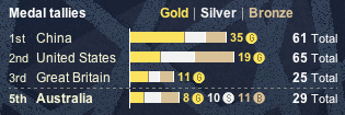
The Boston Globe's is the cleanest of the bunch. I especially like the way they set up the USA count at the top; the use of country codes is inferior to spelling out country names, as done in all of the other examples. The New York Times is the only one to utilize colors to set aside gold, silver and bronze, which lets readers easily assess the two dominant metrics, total golds and total medals. A small touch but very nice.
The biggest design issue here is the existence of the two different metrics. In any tabular presentation, the countries can be ranked by only one metric so the designer must make a choice. The American papers present ranking by total medals; the French paper by total golds; the two Canadian ones shown here are split. The American papers also choose to carry the ranking implicitly while the others explicitly provide a numerical rank. Le Monde and Globe and Mail provide ranks that are consistent with ordering of countries, both by total golds. The Star, by contrast, wants it both ways: the order reflects total medals while the "POS" column shows total golds. This extra column does help the readers who prefer ranking by golds but the primacy of the other ranking has not been overcome.
So what about National Nine News? I have not been a fan of stacked bar charts but surprisingly, this is a great application. Stacked bars have the disadvantage that the stacked segments don't share the same base and thus it is difficult to compare their lengths. Here, though, our two metrics are total medals and total golds so readers should be drawn to compare the total lengths, and the lengths of the first segments. Those wanting to compare silvers and bronzes must make a stronger effort but they will be in the minority.
What can be improved are the distracting data labels, especially the gold circles. Instead, one should provide a scale, or use symbols such as one circle per medal. (See this old post.) Here is a version with a scale:

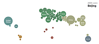
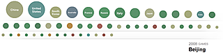
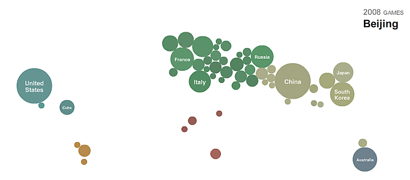
One cannot end this post without mentioning the attempt by NYT editors to insert levity into these proceedings with first a cartogram and then a bubble chart.