Out of line
Out of line
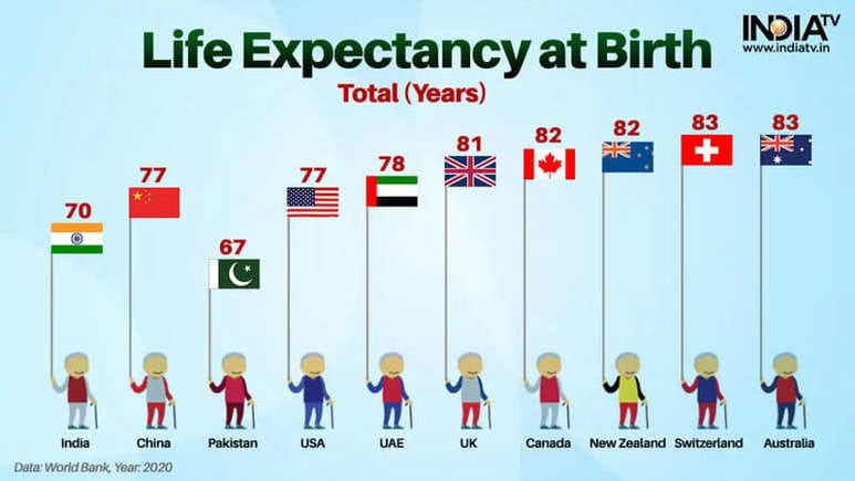
This simple chart showing life expectancies in 10 countries raises one's eyebrows.
The first curiosity is the deliberate placement of Pakistan behind India and China. Every nation is sorted from lowest to highest, except for Pakistan. Is the reason politics? I have no idea. If you have an explanation, please leave a comment.
***
This graphic is an example of data visualization that does not actually show the data.
The positions of the flags do not in fact encode the data! For example, the Indian flag is closer to the Chinese flag than to the Pakistani flag even though the gap between India and China (7) is more than double the gap between India and Pakistan (3).
Here is what it looks like if the gaps encode the data. With this selection of countries, Pakistan and India are separated from the rest.

In the original chart, the readers must read the data labels to understand it, and resist interpreting the visual elements.
I removed the flag poles because they have the unintended consequence of establishing a zero level (where the cartoon characters stand) but the positions of the flags don't reflect a start-at-zero posture.
Returning to our first topic for a second. If the message of the chart is to single out Pakistan, it actually works! If all other countries are sorted by value, with Pakistan inserted out of order, it draws our attention.
In a conventional layout, Pakistan is shoved to the left side in the bottom corner. See below:


