Junk Charts
About
RSS
Posts by Year
Posts by Keywords
Sign in
Subscribe
Axis
Convenience charting
Statisticians have long riled against "convenience sampling", that is, the
Science
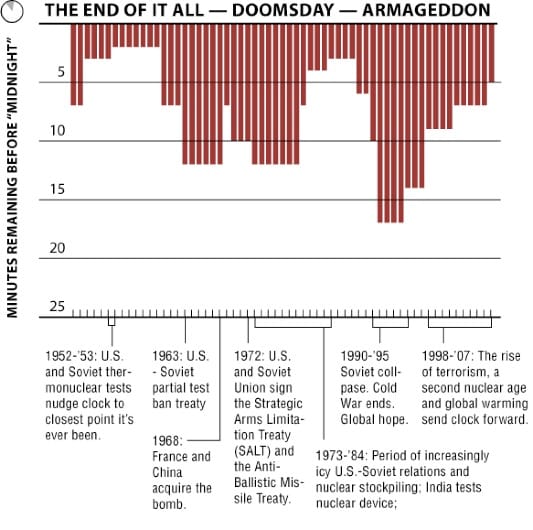
Losing count of Doomsday
The Doomsday Clock is making the news today: because of the growing
Color
Subjectivity
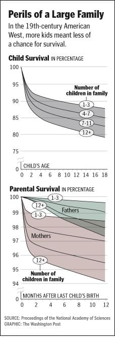
When I look at charts like this one, I ponder: Should graph
Color
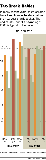
End of year effect?
I agree with JF who suggested that this chart was mind-boggling. The
Bar chart
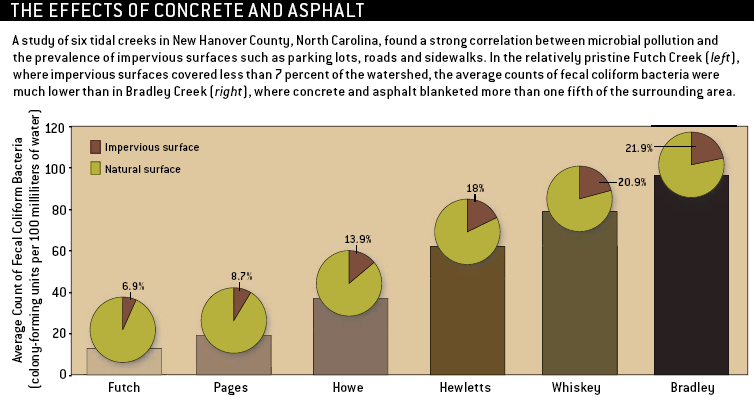
Wading in waste
A poor graphic leaves readers wading in waste, in this case, the
Blogs
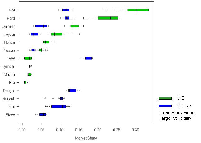
Calming the rip tide
Xan Gregg at Forth Go helpfully scraped the auto market share data
←
Newer Posts
Page 106 of 109
Older Posts
→