Analytics-business interaction Why you must know how analytical results were obtained Kaiser learns that MTA developed a 90% effective vaccine to cure fare evasion on city buses. They just need to go on CNN to sell this miracle.
Algorithms The difference between prediction and estimation Kaiser reacts to an Efron paper on statistical vs. machine learning models.
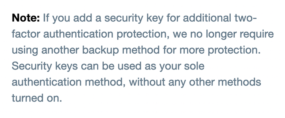
Analytics-business interaction Know your data 33: oops the dog did it Kaiser reads Twitter's admission of misleading users on two-factor authentication.
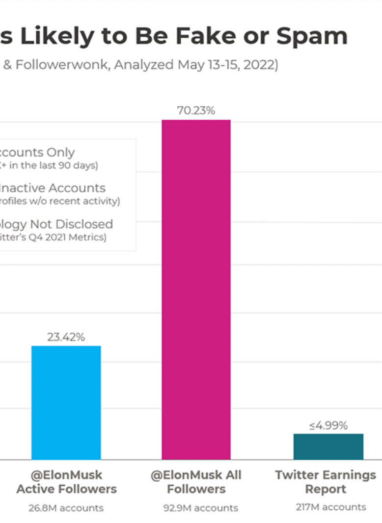
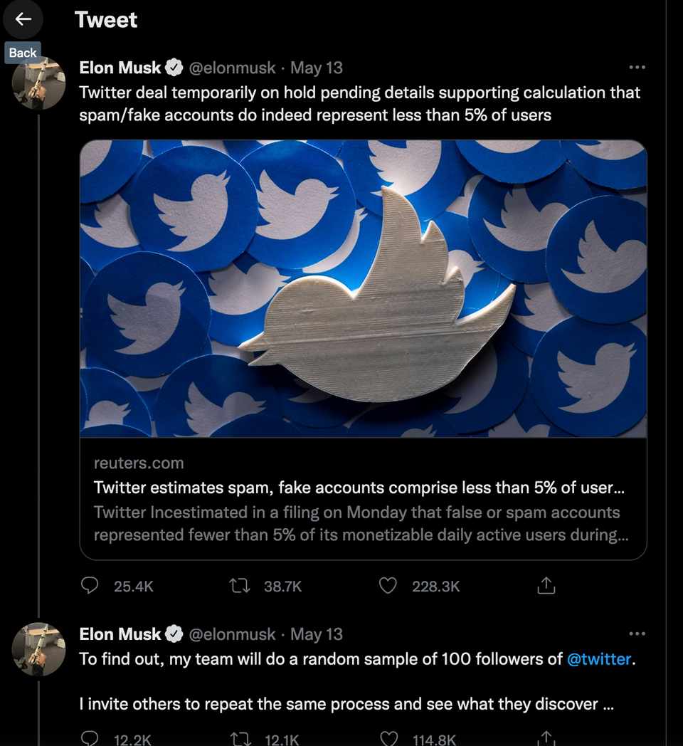
Algorithms Are 81 percent of Elon Musk's twitter followers fake? Kaiser reads an estimate of Musk's spam proportion.
Aggregation The Musk sampling plan, thought through Kaiser examines Elon Musk's plan to find out what proportion of twitter users are spam.
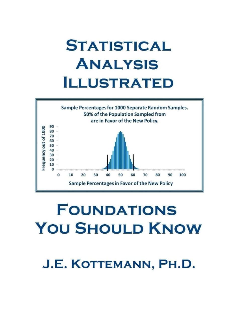
Bayesian Reading Statistical Analytics Illustrated Kaiser reads Kottemann's introductory statistics book.