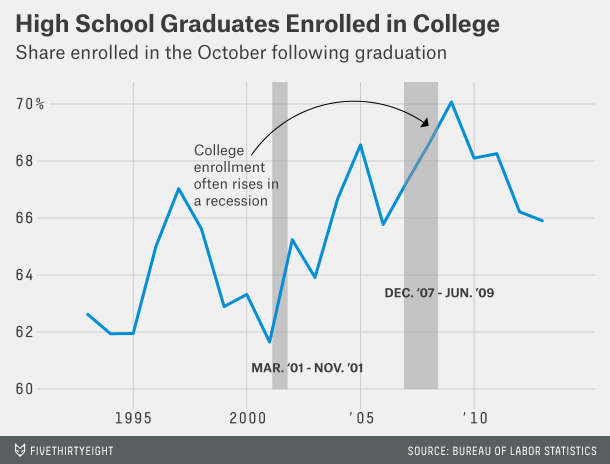
Aggregation Depicting imbalance, straying from the standard chart My friend Tonny M. sent me a tip to two pretty nice
Bar chart Dot plots are under-valued, that's all Bar charts are over-used and over-rated. Just casually, I found this example
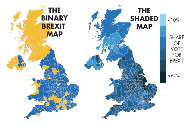
Aggregation Brexit, Bremain, the world did not end so dataviz people can throw shade and color Pick your own distortion
Analytics-business interaction Statistical thinking on my subway commute So I recently moved and needed to find the optimal subway ride