Painting the full picture of the employment situation
It's very frustrating to read the mainstream articles about the recent unemployment report. For example, the New York Times said "U.S. Jobless Claims Hit 15-year Low." (link)
At this point, everyone should be aware of how employment statistics, in particular, the unemployment rate, is computed. Certainly, the editors at the Times have heard of U3 and U6 metrics, and the employment-population ratio. Any report that does not provide all of these metrics is a report that you can't trust.
***
Here is a brief version of the story in a few charts that anyone can easily generate from the FRED site. (link)
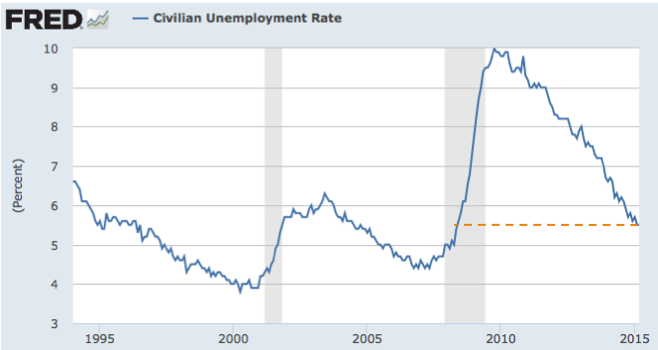
If we only report the headline unemployment rate, the picture looks rosy.

The unemployment rate has been in steady decline since peaking in 2010. The current level hasn't been seen since mid-2008, and we may soon see levels reach levels prior to the recession, i.e. the level of the boom years!
Isn't that a surprise? That's what the mainstream media are reporting.
We are facing a far less rosy picture if we consider a different metric of unemployment.

It turns out the headline statistic uses a very liberal view of who's employed. This second chart is a more "common-sense" count of who's unemployed. Even though the first unemployment metric says we are almost back to pre-recession performance, the second metric says we are still about 2 percentage points above what it used to be in 2008. That is a much less happy picture.
There are two major distinctions between the metrics. If you have a part-time job for even one hour during the period when the government conducts its survey, you are considered "employed" on the first chart but not on the second. Besides, if you are too discouraged to even look for a job, you are not considered unemployed in the first chart but you are unemployed in the second.
***
The most important chart, though, is the employment-population ratio. You might think that an unemployment rate of 5.5% means that 5.5% of the nation's population are unemployed. Not true. Perhaps it means 5.5% of the working-age population (excluding kids and elderly) are unemployed? Still not true.
As a result of a bipartisan effort, the base of that proportion is the number of people whom the government deems to be "wanting a job".

Before the latest recession, the proportion of people who "want a job" has been around 63% for a very long time. During the recession, this proportion plunged to below 59%. Currently, it has moved above 59% but this is about 4% below the mid-2008 level. An extra four percent of the population has decided that they "don't want a job", and they are not counted at all in the unemployment rate in the first chart above.
***
This series of charts illustrate why looking at a single metric is dangerous. By the first metric, the job market is the same as in mid-2008. When we look at the other two metrics, we immediately see that it's the same but not really the same.
I have a whole chapter in Numbersense (link) on employment statistics. In the chapter, I mentioned John Crudele's columns at the New York Post. As usual, he is one who will peel back the onion. His take on the latest statistics is here. While his views can be a bit extreme, reading his take on these statistics is more beneficial to your health than those of the usual sources.


