Picking up the right file
The Institutional Investor advises its readers:
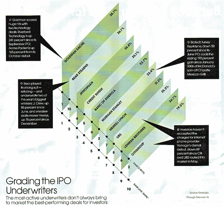
Going public may just be the most important -- and nerve racking -- decision any company will make. Managing and pricing an IPO is tricky, so picking the right underwriter is crucial. Bankers often boast of their league table prowess to win mandates, but quantity does not necessarily mean quality.
By quantity, they meant the amount of underwriting fees (revenues) earned; and by quality, the average stock performance of the newly-public companies, as of Feb 16, 2007.
Ten banks were compared on the two Qs using this chart, which is best described as the "file folder chart".

Amusingly, its creator sized the height of each file according to the quality metric, which is the return % listed at the top right corner of each file. The files were sorted by decreasing quality. Since each file is a parallelogram, its area is proportional to quality.
However, the files overlap, preventing us from comparing the areas of the files. Besides, the point made in the article about the importance of both Qs is lost since this chart stressed quality over quantity. Quantity showed up as a low dot on the tallest file and a high dot on the shortest file.

The junkart version restores the balance. The blue lines highlighted several banks that scored high on one metric but low on the other. The construct is a profile chart, with only two variables.
Curious readers may wonder if there were only 10 banks in the IPO underwriting market. Far from it. The chart designer introduced a selection bias because banks were included based on Quantity, and then Quality was rated. This meant there is possibly a boutique firm with small revenues but higher quality than any of the 10 in the plot.
Furthermore, much useful information is missing, including the dispersion of returns, the number of deals, etc.
Reference: "Grading the IPO Underwriters", Institutional Investor, March 2007.


