Points of comparison
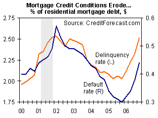

In light of the current housing crisis, arising from mortgage defaults, I pulled this graphic from a Jan 2007 opinion piece that plotted historical default rates of mortgages. Notice the high degree of stretching on the vertical axis that exaggerates the volatility: essentially, the annual delinquency rate ranged from 1.75% to 2.65% during the last six years or so. One might be forgiven to think that a 2% default rate is quite acceptable.

Compare the above chart to the pair that showed up in the NYT in Oct 2007 (see right). The default rates here are in the 10-20% range, very alarming indeed.
The two graphics illustrate a key issue of "aggregation" in statistical analysis. The first graphic is super-aggregated: all types of mortgages of all ages are put together to calculate each year's default rate. The second graphic hones in on subprime mortgages only.
More importantly, the second graphic presents data in "vintages". Each line represents loans originated during a particular year (a "vintage"). This establishes comparability. On the first chart, each point in time represents the default rate of mortgages averaged over all ages (some loans may be only a few months old; others may be 15 years old). Since the default rate is much higher for very young mortgages than for older mortgages, such averaging hides crucial information.
Overall, the NYT graphic very effectively conveys the alarming trend of new mortgages performing much worse, especially those originated in 2007.

It can benefit from two slight edits: adding a few more years, and using vertical lines (the most critical comparisons are default rates for loans of a given age!) Something like this...
Sources: "As Defaults Rise, Washington Worries", New York Times, Oct 16 2007; "Mounting Mortgage Credit Problems", economy.com, Jan 23 2007.


