Progress and retrogress
Joran E. pointed to this "icky" chart he found on Clive Crooks' blog at the Atlantic.

He ordered a "junkchart treatment", so here it comes.
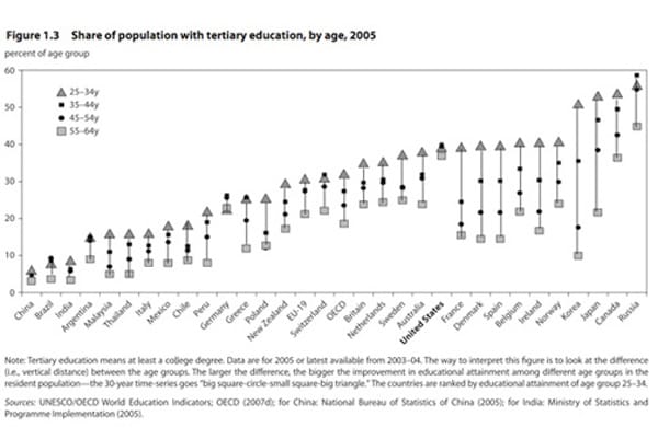
First we wanted to process the triangles, dots and squares to make sense of this data. We noted that the data came from a single year (2005) so the chart did not trace the development of the education sector over time. But wait, it used a different route to get at the same idea. The author compared different generations within each country to see if more and more citizens took university degrees. So each vertical "arrow" was kind of a historical record of different generations within a country. Under this criterion, Korea and Japan had come a long way while the US and China stagnated.
The chart is quite impossible to read as designed. There is little reason to sort by 25-34-year-old proportion when the message concerns improvement over generations. Besides, what about countries that apparently retrogressed? (like Russia and Germany)

For this data, I returned to my favored bumps chart. Here is version one. There are two ways to read this chart: across countries, we note that most of the European states (blue) had similar profiles showing roughly a constant rate of growth. The Asian duo of Japan and Korea (brown) had the most marked growth. Of North America (black), Canada diverged from the US since the 35-44 generation.
Alternatively, we can focus on the change generation-over-generation. From 55-64 to 45-54, almost all countries in this sample (except Japan) grew at the same rate. Then between 45-54 and 35-44, the two Asian countries clearly set the pace. The generation between 35-44 and 25-34 is most interesting: Korea has not slowed, Japan has slowed a little but still grew as fast as Canada. A trio of European countries (Spain, Ireland, France) outpaced their neighbors.
Below I show version two. This one combines bumps chart with small multiples. North America, Europe and Asia/Australia are now in separate charts. This removes clutter.


