Pure delight

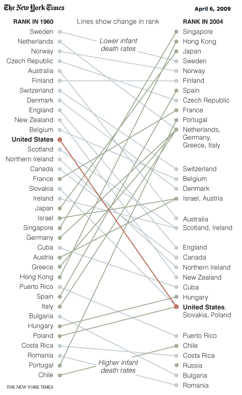
My favorite Bumps chart in the New York Times ...
For the purist, this is the original rank-based version.
With judicious use of color and background/foreground, this makes for a good story.
The color scheme here, however, is a bit bland. Green for improvement, blue for decline and orange for USA.
Note, for example, New Zealand and England both suffered similar drastic drops as the US.
It would be better to (for example) split out the large improvements and large declines, or to split out the developed world versus the developing world.
This chart is created like this probably because the accompanying piece makes only passing reference to this chart so there is not a clear message to the creator what to do with the data.
Interestingly, there were no ties in 1960 but quite a few ties in 2004. I wonder why. I'd shift the dot to the mid-point between ranks rather than move them up to the higher rank.
All in all, a much more engaging way to present this data than the reams of table found in say the UN World Development Report.
Reference: "Vital Statistics: U.S. Still Struggling With Infant Mortality", New York Times, April 6 2009.


