Restoring symmetry, and another survey debunked
Reader John G. submitted a chart plus its improvement. Thank you!
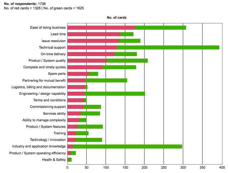
The problem chart is used to present a "net promoter score" analysis by ABB (link). Net promoter score is the difference between people who will recommend a product or company and people who won't. The chart presents the components, the number of people who gave "red cards" and the number giving "green cards".

Unfortunately, the symmetry in the definition of the net promotor score is destroyed by this stacked bar chart. The red bars are all aligned against the vertical axis but the green bars aren't so it's difficult to compare their lengths.
John fixed this problem by aligning both sets of bars against a vertical axis. Sensibly, he places the red bars along the negative direction. He also orders the categories by "margin of victory", whichin effect is the net promoter score, with the category needing the most attention at the top.

The improved chart points out some of the complicating factors in understanding a metric that is composed of two components each of which vary and can be missing. For example, a category like "technical support" is rated among the highest overall but this conceals the fact that it is one category that receives many red cards. Also, consider "product/system quality" versus "health and safety": both categories end up with about the same net promoter score but the former category has many more respondents than the latter.
***
John also tried a scatter plot. This one requires some careful reading. The best categories are going to end up in the top left corner; it may be better to flip the red card axis to a descending order so that the top right corner is the best corner.

The diagonal rays (axes) are great visual aids to help figure out which categories are better and which are worst.
I am a little turned off by the crowdedness in the bottom left corner of the chart. Those are categories with relatively low levels of red or green cards, and also relatively balanced between reds and greens... that is to say, those are categories people don't care too much about, and among those people who care, there isn't a consensus about good or bad. In other words, the survey revealed very little of use about those categories. It bothers me that much of the survey ended up collecting data on such items.


