Rise and fall

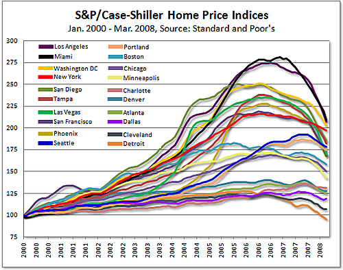
Via Adam came this "colorful" chart of the rise and fall of house prices since 2000, as measured by the Case-Shiller index. He commented that this showed the old saw "the taller they are, the harder they fall".
A different chart allows us to test this theory directly. From the above, we noted that each curve was composed of two phases, a long rise from 2000 to roughly mid-2000s followed by a steep decline. We computed two data series: the average monthly growth rate during the inflation phase and the average monthly decline during the deflation phase. The scatter plot showed the correlation.
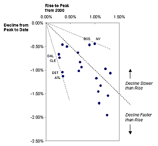
The dots displayed pretty strong correlation, confirming that on average, the faster they rise, the steeper they fall.
The diagonal line indicated equal rates of growth and subsequent decline. The cities above the line, especially Boston and New York, have witnessed declines that were much slower than the earlier rises. On the other end, cities like Detroit, Cleveland, Atlanta and Dallas suffered price deflation much faster than earlier inflation. Indeed, the ratio of decline to rise rates is given by the slope from the origin to the dot.
As for the original chart, it showed all the signs of Excel defaults. It just does not make sense for a charting program to pick a different color for each time series, no matter how many there are. Beyond four or five colors, it is impossible for readers to tell the lines apart. In these situations, we should adopt a foreground / background strategy: decide on the key lines, highlight those with color, gray out the remaining lines.
Reference: Standard & Poor


