Ron Paul confuses the charts
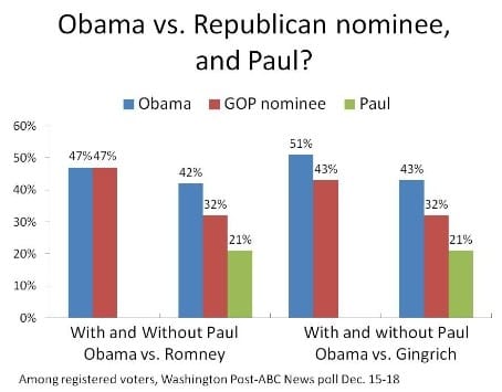
Andrew Sullivan (link) re-printed this grouped column chart showing the result of a Washington Post-ABC poll on how voters say they would react to Ron Paul running as an independent candidate in next year's U.S. presidential election.

One aspect of this chart bothers me... depending on one's familiarity with the election politics, the need to read carefully both the titles at the bottom of the chart, and the legend, and possibly also the title of the chart (or the knowledge that the Republican wears red and Democrat blue) in order to orient onself. You can experiment by blocking out one or two of these three items.
Here's the same chart with a small number of fixes. Printing the legend onto the bars themselves makes the data more readable. This change necessitates flipping the columns over to horizontal bars. There are pros and cons to using a stacked chart versus a grouped chart.

Neither of these charts answer the burning question in the reader's mind, which is likely to be from whom would Paul take his votes. The key message from above is that the insertion of Paul is projected to make the identity of the Republican candidate irrelevant. The following flow chart emphasizes the shift in votes as opposed to the vote totals.

It appears that the Others/Undecided voters who can still swing the election do not consider Ron Paul as a desirable alternative. Most of Ron Paul's supporters would come from voters who would have cast their votes for the Republican or Democratic candidate (by a ratio of 3 Republican votes to 1 Democratic vote if Romney is running, or 3 to 2 if Gingrich is running).


