Self-sufficient charts
A good example showed up in the New York Times recently of a chart that fails the self-sufficiency test that I often speak about here. First, the doctored chart (with the data removed):

And for comparison, the chart as originally printed (the chart was found only on the paper edition but not on line):
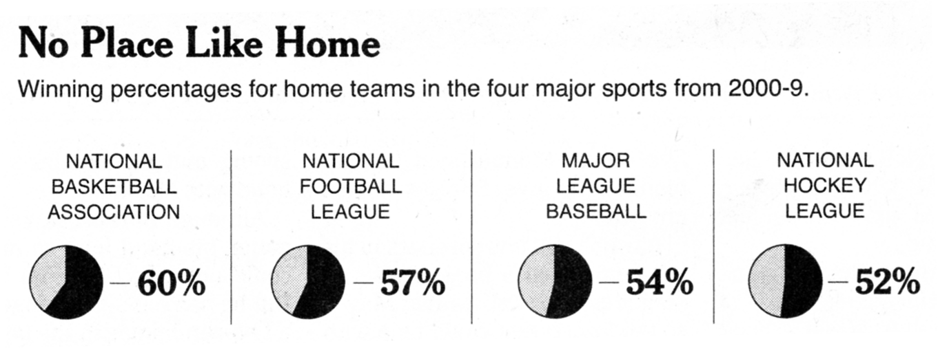
There is little doubt that the second version, with the data -- all four numbers -- printed on the chart, is much more effective, and that is why the designer thought to include them.
This shows that readers are gravitating to the data rather than the graphical constructs, and thus I consider these types of charts not self-sufficient. The graphical constructs can't stand on their own.
***
The choice of pie charts in a small-multiples arrangement is a mistake for this data set. While indeed in theory the winning percentage could range from 0 to 100%, in practice the winning percentages are rather narrowly dispersed (with the exception of the NFL which has a 16-game regular season).
Just quickly looking up the 2009 regular seasons: MLB teams ranged from 36% (Nationals) to 65% (Yankees); NHL ranged from 32% (Islanders) to 65% (Bruins); NBA from 21% (Sacramento) to 81% (Cleveland).
In order to judge whether 60% or 52% is a large or small number, readers need to have a sense of how teams are dispersed around those averages. A side-by-side boxplot brings this out pretty well (the data is for 2009 seasons).
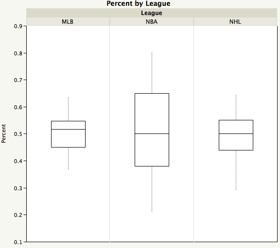
The "box" in a boxplot contains the middle 50% of the teams in each league while the line inside the box depicts the median team (in terms of winning percentage).
The NBA teams showed much higher variability in winning percentages than the NHL or the MLB. The difference in average winning percentage of say, 2% or 5%, from one league to the next is not remarkable, given this fact.
(The original article did not really pertain to such a comparison so the reason for this chart is not clear.)