Scale restoration
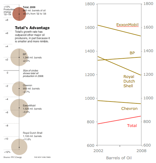
The original graph threw us off our sense of scale. It seemed to be saying all these oil companies are roughly the same size but one grew much faster than the others. The red color and the setting off of the data above the title of the chart seemed to announce some important find.
The junkart version on the right reversed everything to our normal sense of scale. It is a version of the bumps chart, one of my favorites.

So we find that Total is the smallest of these oil companies, about half the size of ExxonMobil -- you wouldn't know that from those abysmal bubbles! Adding to the problem is that the growth data is used to sort the companies while the actual production data is hidden in the data labels.
Total is indeed growing faster but BP is not far behind. The fall of ExxonMobil and Royal Dutch Shell is equally intriguing.
Reference: "Total, the French Oil Company, Places Its Bets Globally", New York Times, Feb 21, 2009.


