Seth on bar charts

Seth followed up his post about graphics with a specific post about pie charts versus bar charts. He prefers pie charts. We happen to agree with his unhappiness of grouped bar charts. Unfortunately he compared an univariate pie chart (depicting point-in-time data) with a multivariate bar chart (iluustrating time-series data).
Here we present a different example, derived from a NYT article on diabetes in America. The original chart is a series of pie charts, one for each age group, and one for the aggregate data.
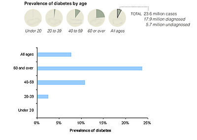
The junkart version uses a bar chart. Readers can get a more precise comparison of the prevalence rates across age groups because it is easier to judge lengths than areas. This has been scientifically proven by the likes of Cleveland.
Dirty trick, you might say because the original chart actually prints the data in each pie.
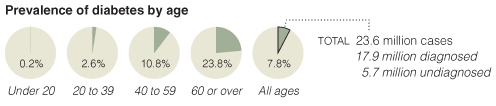
So now there is no mistaking the data. This raises a philosophical question: why bother graphing the data if the reader needs to read the data in order to understand the chart? We call this the self-sufficiency test. The graphical elements of a pie chart can't stand on their own.
Reference: "Diabetes - underrated, insidious, and deadly", New York Times, July 18 2008.


