Shower of bullets

Here's one of those infographics that makes the reader work hard (via Dustin J). The graphic in its full glory is here; it's much too large to be reproduced, and I have clipped off the bottom half.
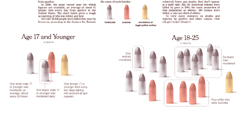
Much to the designer's credit, he extracted data of interest, rather than trying to cram everything onto the page. In particular, he was most interested in the distribution of deaths among different age groups, the types of deaths (suicides, homicides) and the identities of the deceased (race, gender).
Just like the election fraud graphic, such rich data lend themselves to multiple levels of aggregation. Here, the designer focuses on the most detailed level, making it easiest to see facts like "among the 18-25 age group, there were 6 black men murdered per day".
However, it takes much more attention to notice higher-level facts like "homicides per day are relatively flat across age groups while suicides heavily skew toward 40+".

In the junkart version, I decided to emphasize the more aggregated data, showing the number of deaths of each type across age groups. The detailed break-down of race and gender is shoved into parentheses, as they can be omitted by less serious readers.
The reader who discovers that the homicide/suicide pattern described above may surmise that homicide gunfire deaths are more "random" while suicides, being premeditated, may affect older people disproportionately. More research would be needed to confirm such and other suspicions.
Source: "An Accounting of Daily Gun Deaths", New York Times, April 21 2007.


