Small multiples re-imagineered
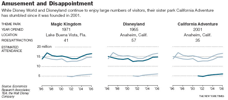

This chart gave me trouble. I kept staring at it, staring. Searching for the legend. What could the several lines, in different colors, represent? Take a look yourself.
Well, it turns out all three graphs were duplicates. A different line was given dark blue to highlight a particular amusement park.
I have not seen this tactic used before. This is like a small multiples concept except that every chart contains the same data. Is it better than having just one chart?
Reference: "Will Disney Keep Us Amused?", New York Times, Feb 10 2008.
PS. [4/6/2008] Here are two alternative charts contributed by our readers. See comments below.
Derek suggested using sparklines:

Zuil reverted to basics:


