Spin, spin, spin away
If the data is bad, no amount of graphical magic can save it
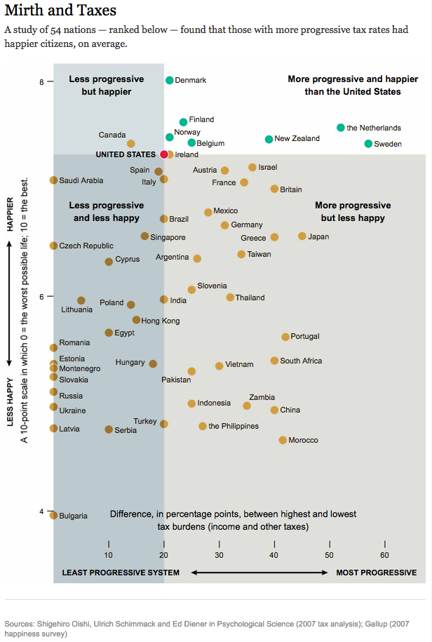
From a purely graphical perspective, the following NYT chart (link) is well executed:

Labeling is always a challenge with scatter plots. Here, they have 54 points, and the chart still doesn't look too crammed. I like the axis labels, and the clear labeling of the four quadrants.
I also like the vertical scale that goes from 4 to 8, despite the scoring range going from 1 to 10. This trims unneeded whitespace and magnifies the differences between nations.
***

In the Trifecta checkup, we also care about what the key question the chart is designed to answer, and how it relates to the graphical element. According to the subtitle, this chart showed that "the nations with more progressive tax rates had happier citizens."
This conclusion certainly does not jump off the page. Reader Christopher L. who submitted this chart found "no obvious trend." (Given the source, I suspect it's the researchers who drew that conclusion.)
There are lots of unanswered questions in an international comparison of subjective results of this type:
- How were the 54 nations chosen?
- Is the year 2007 representative of the recent situation in every one of these countries? Were there any tax reforms in 2007 in any of these countries?
- How reliable is the Gallup poll in each of these countries? How large are the sample sizes? Is it the same survey?
- Why is the difference between the highest and lowest tax burdens the right measure of progressiveness? And are they using the marginal tax rates or the average tax rates? (Judging from the Wikipedia page, there is a lot of arbitrariness in determining a country's tax rate.)
- Are the two data sources comparable? Happiness is a personal question while the range of tax rate is an aggregate metric, with each individual only experiencing one tax rate.
These are not trivial questions. If the data is bad, no amount of graphical magic can save it.
Most vexing for a display like this is that it forces the reader to look for the impact of tax burden on happiness. That's how the question is framed. There is nothing in this chart, though, that suggests that tax rates can explain happiness, and certainly nothing to suggest that low tax rates cause more happiness.
I call this story time. Put up some data, then spin stories and spin away.