Spinning multi-color

New York Times has a great pointer to the Global Warming Art website. The author Robert Rohde wants to popularize environmental science by visualization of the data. There are many interesting charts and well worth repeated visits.
These pie charts cry out for some re-dressing:
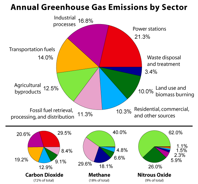
The pie charts, the colors, the whole works. Most troubling is that each pie has its own sorting scheme, and because the text labels were not reproduced in the smaller pies, the reader is sent scrambling around to find the right labels.
In addition, these pie charts, as with almost every other pie chart, fail the self-sufficiency test. Without all the data printed next to each sector, the reader is simply unable to judge the size of each sector.
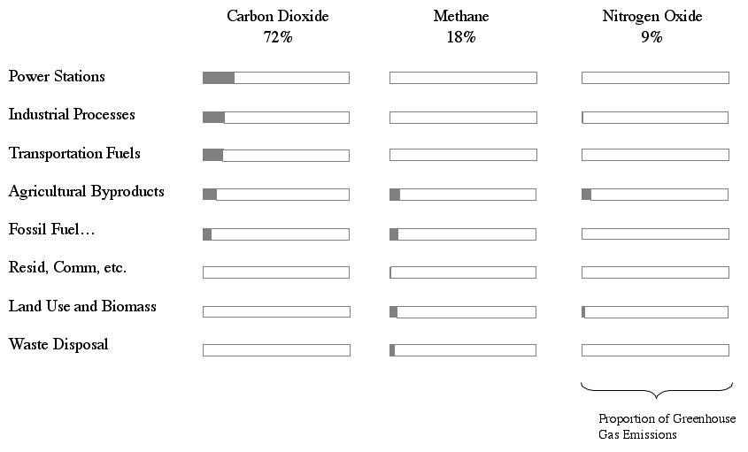
Further, the aggregate data (larger pie) may not be as relevant after realizing that the smaller pies show very different patterns. The following junkart version tries to bring out this fact by treating both dimensions (type of greenhouse gas; source of emission) equitably.
While I picked on this particular chart, I must say I support Robert's effort and wish him luck in this very well-intentioned project.


