Spinning the climate
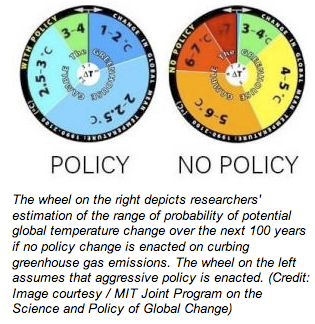
Mike L. pointed us to this pair of "climate change model pie charts", with the brief comment "Yuck".
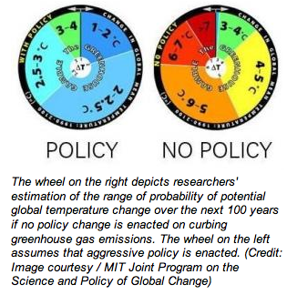
What they are doing is to use the spinning wheel analogy to present probabilities (odds). Not a good use of pies either. Histograms do the job with minimal fuss:
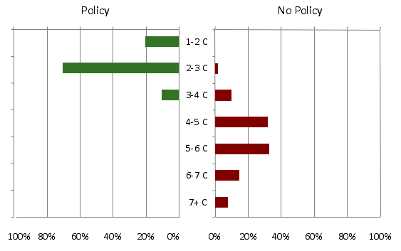
I collapsed the 2-2.5 and 2.5-3 degrees sectors since every other one is a one-degree interval. We see immediately that the effect of the policy is to shift the probability distribution to changes of fewer degrees.
Reference: "Climate change odds much worse than thought", Science Daily, May 20 2009.


