Junk Charts
  • About
  • RSS
  • Posts by Year
  • Posts by Keywords
Sign in Subscribe

Archive: 2007

Subjectivity
Color

Subjectivity

When I look at charts like this one, I ponder: Should graph
Read More
Losing count of Doomsday
Science

Losing count of Doomsday

The Doomsday Clock is making the news today: because of the  growing
Read More
Convenience charting
Axis

Convenience charting

Statisticians have long riled against "convenience sampling", that is, the
Read More
Is it random?
Blogs

Is it random?

A puzzle (from Laurie Snell, via the Gelman blog): are the tiles
Read More
Bubbles of death
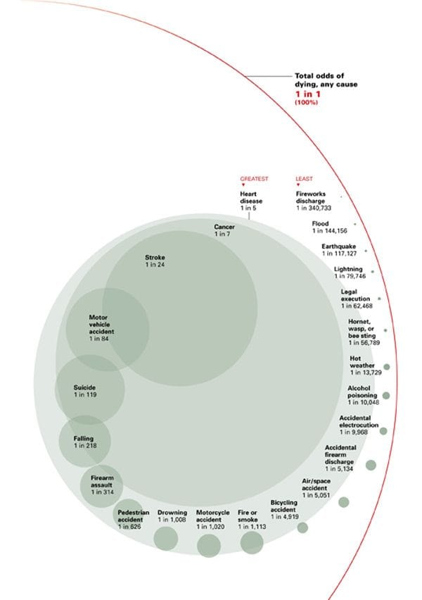
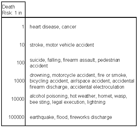
Bubble chart

Bubbles of death

Thanks to Dustin J for bringing this stupendous chart to our attention.
Read More
Bubbles of death 2
Aggregation

Bubbles of death 2

Here is an alternative way to present the death risk data.  It&
Read More
Page 1 of 5 Older Posts →
Junk Charts © 2025
  • BOOKS
  • COURSES
  • PRESS
  • CONSULTING
  • COACHING
  • CONTACT
Powered by Ghost