Junk Charts
About
RSS
Posts by Year
Posts by Keywords
Sign in
Subscribe
Archive: 2009
Background
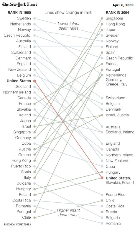
Pure delight
My favorite Bumps chart in the New York Times ... For the purist,
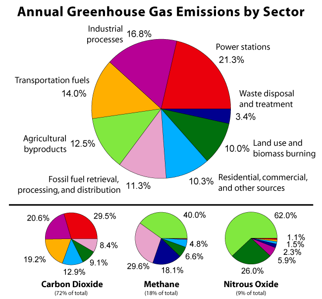
Aggregation
Spinning multi-color
New York Times has a great pointer to the Global Warming Art
Axis
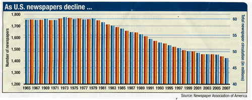
The trouble with two lines
It's never a good idea to put two scales on
Bar chart
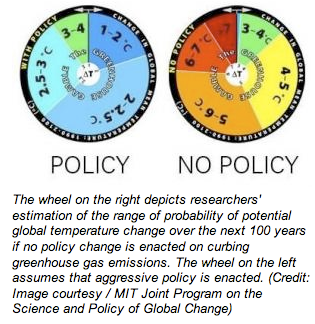
Spinning the climate
Mike L. pointed us to this pair of "climate change model
Business
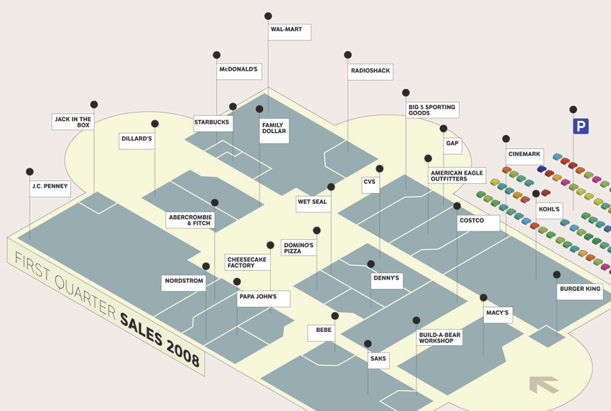
The case of the shrinking mall
I had a similar reaction when reading this chart but I will
Axis
Visual analogies
Many a startling faux pas in graphics start with the desire to
←
Newer Posts
Page 2 of 4
Older Posts
→