Junk Charts
  • About
  • RSS
  • Posts by Year
  • Posts by Keywords
Sign in Subscribe

Archive: 2014

An overused chart, why it fails, and how to fix it
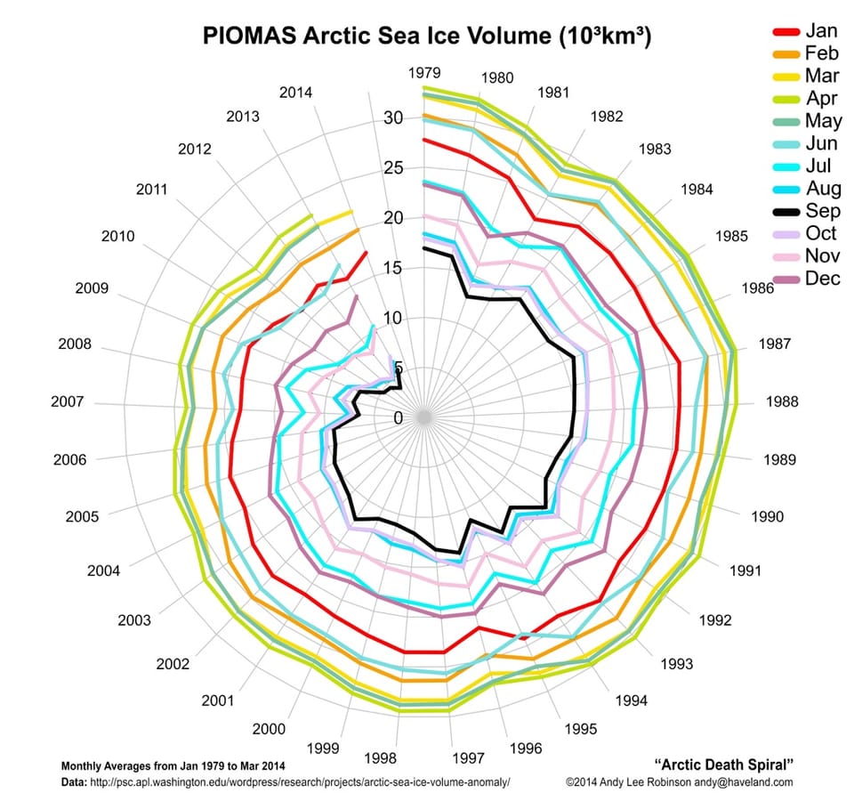
Spider chart

An overused chart, why it fails, and how to fix it

A chart with conceptual appeal but fails the data
Read More
Take back the GPA
Blogs

Take back the GPA

Princeton - apparently due to pressure from parents - is on the
Read More
How effective visualization brings data alive
Aggregation

How effective visualization brings data alive

Bringing data alive
Read More
The index of an index is confusion
Index

The index of an index is confusion

The puzzle of negative numbers
Read More
Junk Charts Trifecta Checkup: The Definitive Guide
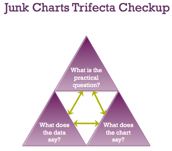
trifecta checkup

Junk Charts Trifecta Checkup: The Definitive Guide

Kaiser Fung, from Junk Charts, explains the data visualization framework known as the Trifecta Checkup, used to conceptualize and critique data graphics and charts.
Read More
Another PR effort to scare you into clicking
Bias

Another PR effort to scare you into clicking

From Andrew Gelman's blog, I learned about a paper that
Read More
← Newer Posts Page 4 of 6 Older Posts →
Junk Charts © 2025
  • BOOKS
  • COURSES
  • PRESS
  • CONSULTING
  • COACHING
  • CONTACT
Powered by Ghost