ray vella Aligning the visual and the message Student of Ray Vella's NYU class produces a delightful project
Area chart Two challenging charts showing group distributions Two complex charts that show subgroup distributions of data
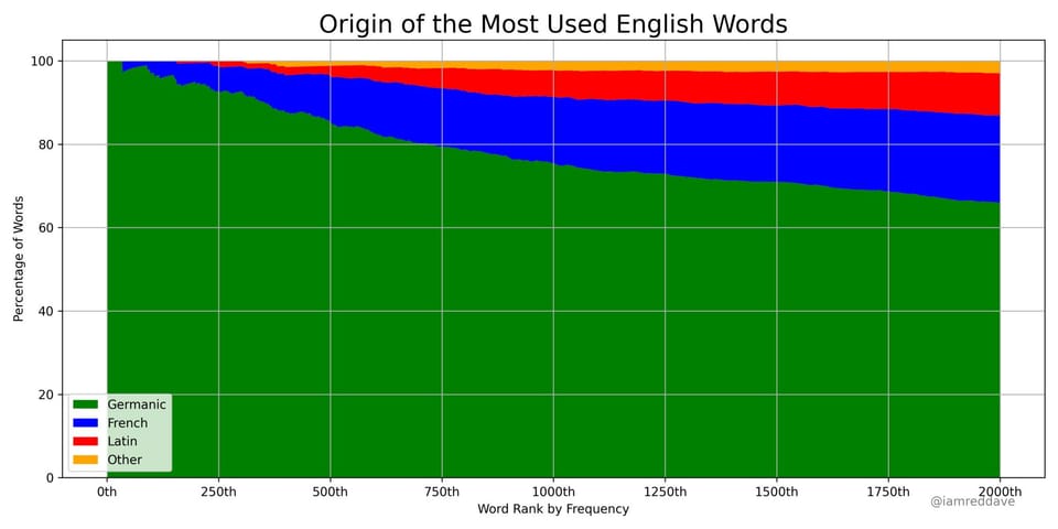
Aggregation Check out the Lifespan of News project Kaiser Fung (Junkcharts, Principal Analytics Prep) reviews the Lifespan of News project that tracks the rise and fall of news stories over time and space, using Google search data.
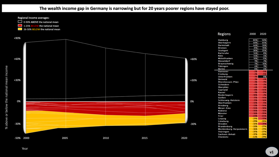
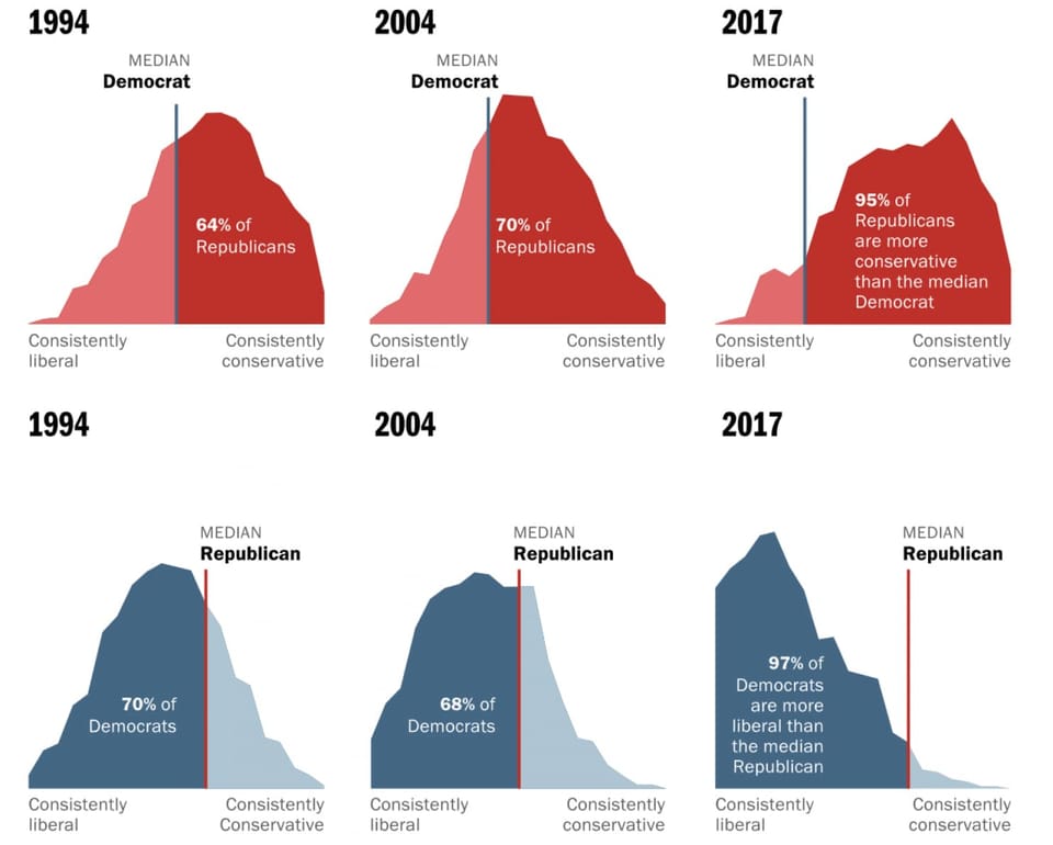
Area chart Let's not mix these polarized voters as the medians run away from one another In-depth look at Washington Post's fantastic feature on median U.S. voters
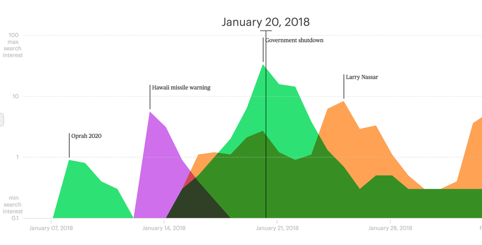
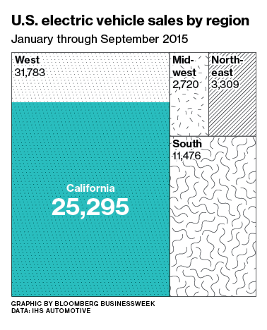
Area chart Finding meaning in Big Blue California Via Twitter, Pat complained that this Bloomberg graphic is confusing: The accompanying