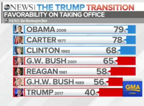
Bar chart Butcher: which part of the leg do you want? Me: All of it, in five pieces please This ABC News chart seemed to have taken over the top of
Aggregation Depicting imbalance, straying from the standard chart My friend Tonny M. sent me a tip to two pretty nice
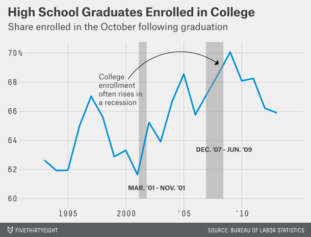
Bar chart Dot plots are under-valued, that's all Bar charts are over-used and over-rated. Just casually, I found this example
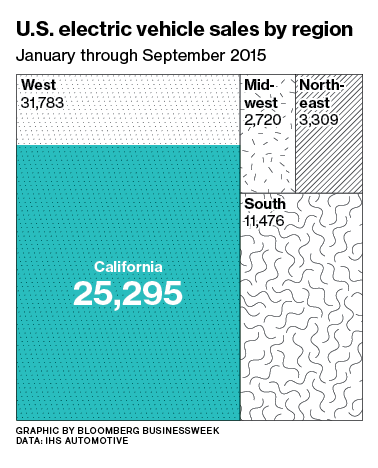
Area chart Finding meaning in Big Blue California Via Twitter, Pat complained that this Bloomberg graphic is confusing: The accompanying
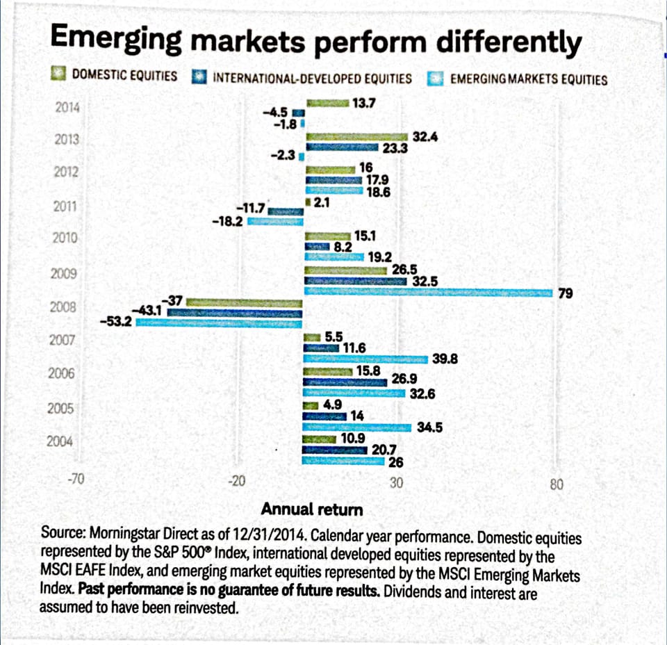
Axis Nice title but dubious message I like to uaeuse declarative titles for charts. This chart below, found