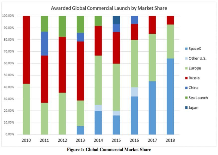
Axis Another simple Excel chart needs help Kaiser Fung, founder of Principal Analytics Prep and Junk Charts, takes apart an Elon Musk chart, created using some Excel defaults.
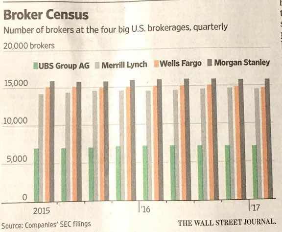
Axis Making people jump over hoops Kaiser Fung, founder of Principal Analytics Prep and Junk Charts, comments on a WSJ chart about how banks pay their brokers
Aggregation It's your fault when you use defaults The following chart showed up on my Twitter feed last week. It&
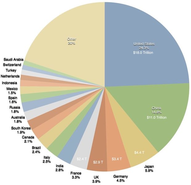
onelesspie Making the world a richer place #onelesspie #PiDay A colorful pie chart on Wikipedia, saying not much
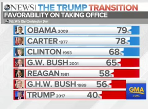
Bar chart Butcher: which part of the leg do you want? Me: All of it, in five pieces please This ABC News chart seemed to have taken over the top of