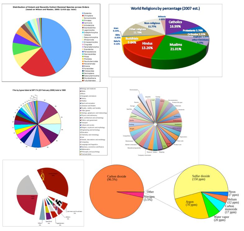
onelesspie Pi Day Special: #onelesspie initiative to clean up Wikipedia Wikisphere is filled with pies
Bar chart Pi Day Special: #onelesspie initiative to clean up Wikipedia Xan Gregg and I talked about how we should celebrate PI day.
Bar chart The inutility of stacking columns When I see a stacked column chart like this: (via Andrew Sullivan)