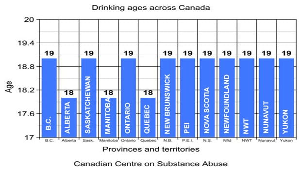
Junk Charts
  • About
  • RSS
  • Posts by Year
  • Posts by Keywords
Sign in Subscribe

Bar chart

The meaning of most
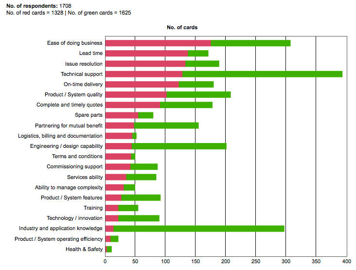
Bar chart

The meaning of most

Megan McArdle started the war on infographics (link). And reader Danielle A.
Read More
Restoring symmetry, and another survey debunked
Axis

Restoring symmetry, and another survey debunked

Reader John G. submitted a chart plus its improvement. Thank you! The
Read More
Ron Paul confuses the charts
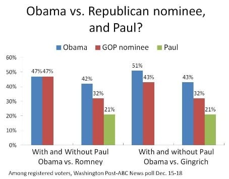
Bar chart

Ron Paul confuses the charts

Andrew Sullivan (link) re-printed this grouped column chart showing the result of
Read More
The massive burden of pie charts
Bar chart

The massive burden of pie charts

The world would be a better place if pie charts were banned.
Read More
Worst statistical graphic nominated
Aggregation

Worst statistical graphic nominated

Phil, over at the Gelman blog, nominates this jaw-dropping graphic as the
Read More
A skewed view of ten Indian states
Axis

A skewed view of ten Indian states

The Economist published this chart to illustrate the problem of the "
Read More
← Newer Posts Page 13 of 20 Older Posts →
Junk Charts © 2026
  • BOOKS
  • COURSES
  • PRESS
  • CONSULTING
  • COACHING
  • CONTACT
Powered by Ghost