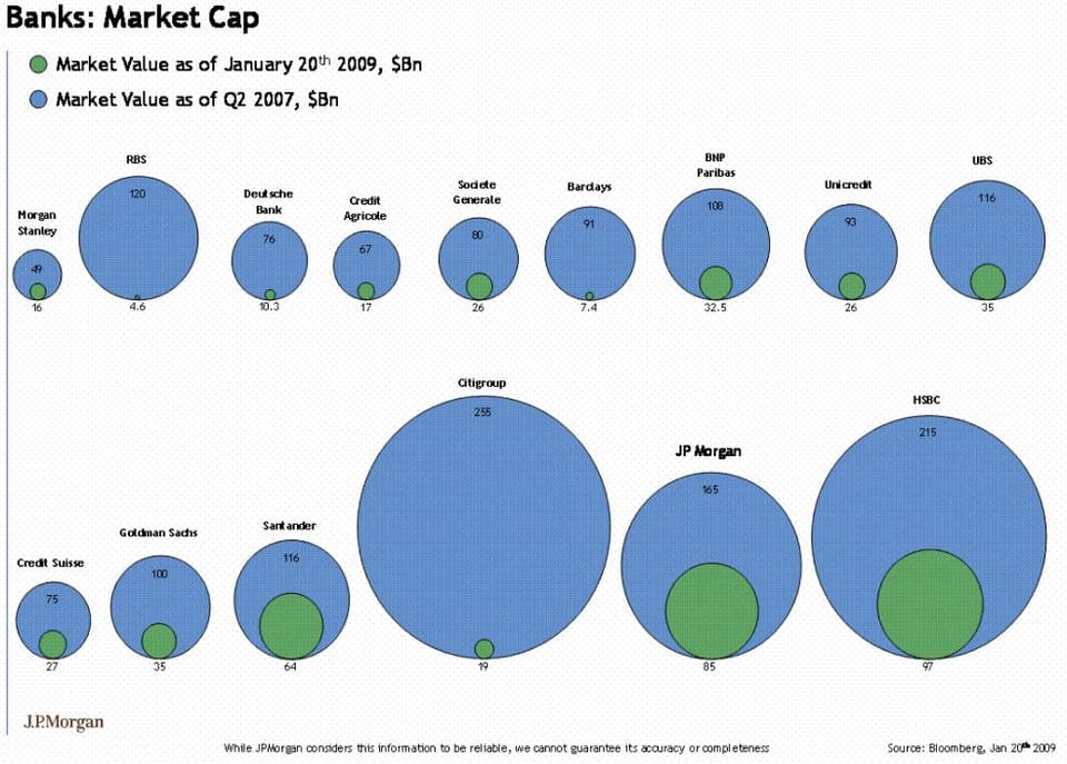
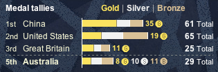
Junk Charts
About
RSS
Posts by Year
Posts by Keywords
Sign in
Subscribe
Bar chart
Background
From bad to worse
Pie charts can range from bad to worse. Brent L. pointed us
Axis
Lining things up
Guess where I went for vacation (clue in the chart). This long,
Axis
Olympic tallies
Andrew N., a reader from Australia, wasn't too impressed with
Bar chart
Seth on bar charts
Seth followed up his post about graphics with a specific post about
Bar chart
Close races
Perhaps harkening to the close race between Obama and Clinton, the designer
Aggregation
Whither complexity?
The ever interesting Gelman blog ("Too clever by half") ponders
←
Newer Posts
Page 17 of 20
Older Posts
→