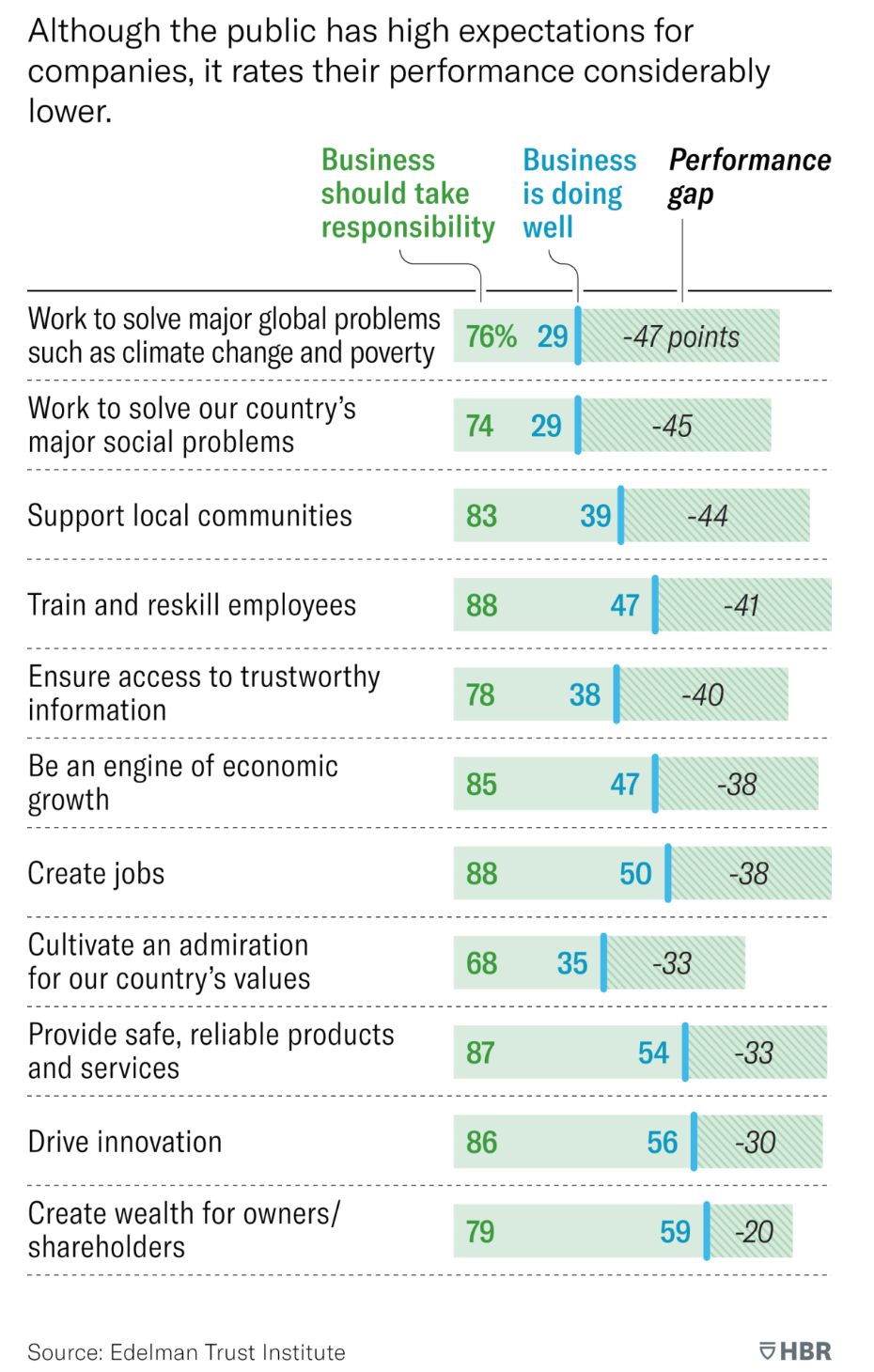
Bar chart Reading log: HBR's specialty bar charts Today, I want to talk about a type of analysis that I
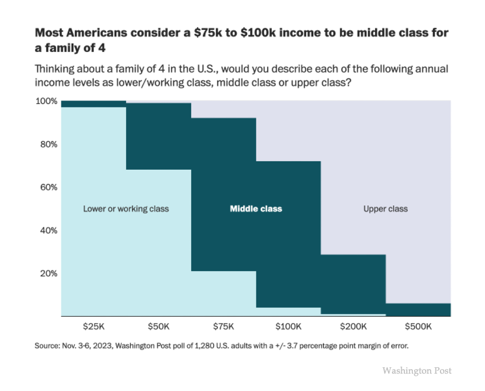
income distribution Lost in the middle class Kaiser reads how the Washington Post defines middle class.