ray vella Displaying convoluted indices Kaiser shows how a small change in structure clarifies comparisons on a data visualization project.
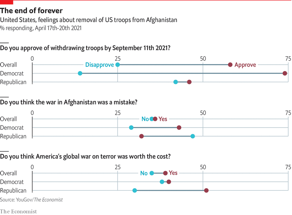
return on effort Reading this chart won't take as long as withdrawing troops from Afghanistan Kaiser deciphers a chart showing Americans' response to Biden's decision to withdraw troops from Afghanistan.
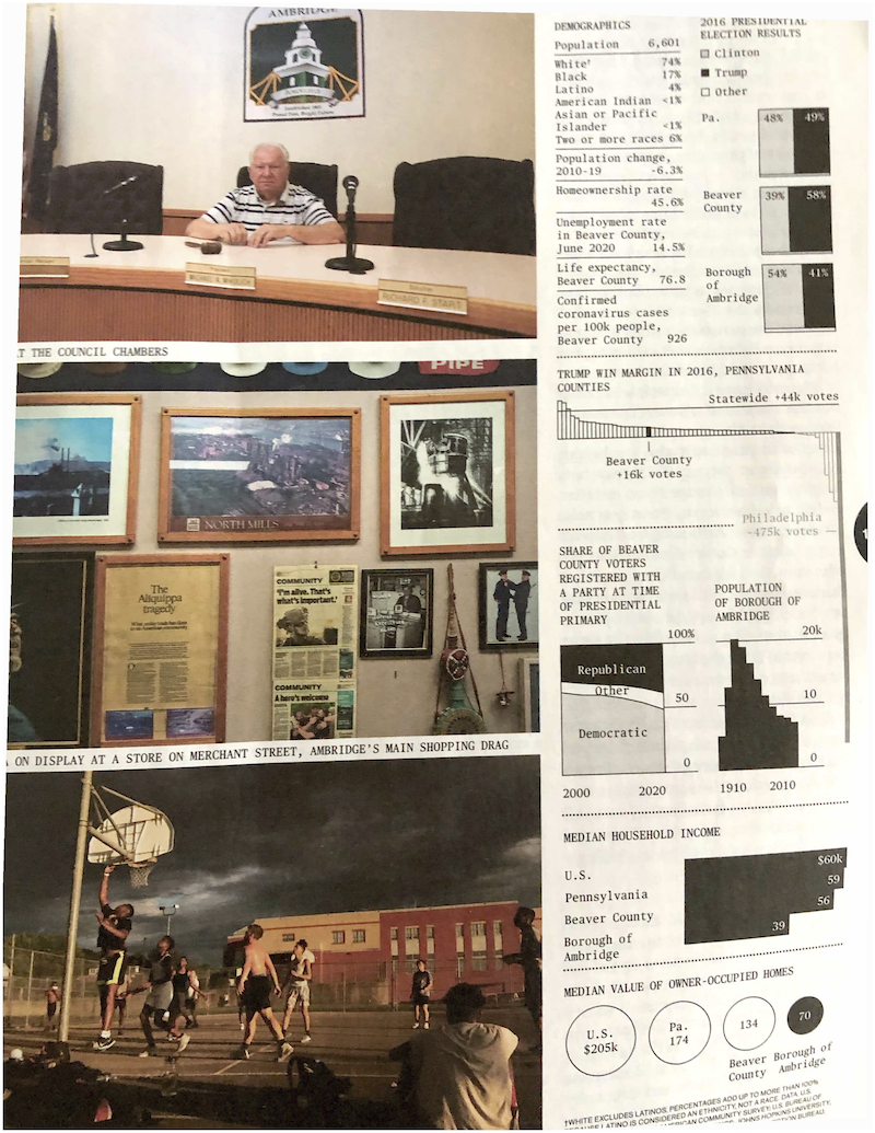
ray vella Two commendable student projects, showing different standards of beauty Kaiser discusses two dataviz projects by NYU students.
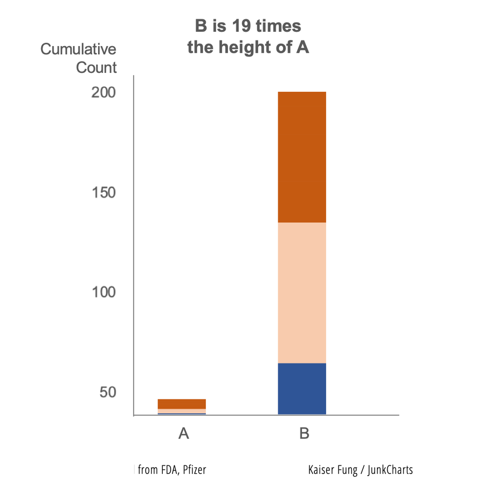
Axis Vaccine researchers discard the start-at-zero rule Kaiser revisits the practice of manipulating the vertical axis of a column chart.
return on effort Bloomberg made me digest these graphics slowly Kaiser enjoys reading the graphics in the Businessweek issue on elections.
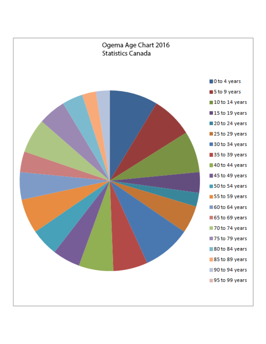
Pie chart Doing my duty on Pi Day #onelesspie Kaiser Fung, founder of Junk Charts and Principal Analytics Prep, celebrates Pi Day by remaking a pie chart from Wikipedia.