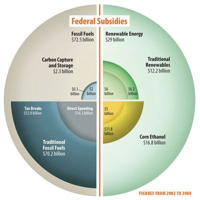
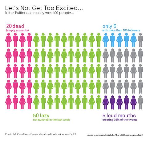
Aggregation Worst statistical graphic nominated Phil, over at the Gelman blog, nominates this jaw-dropping graphic as
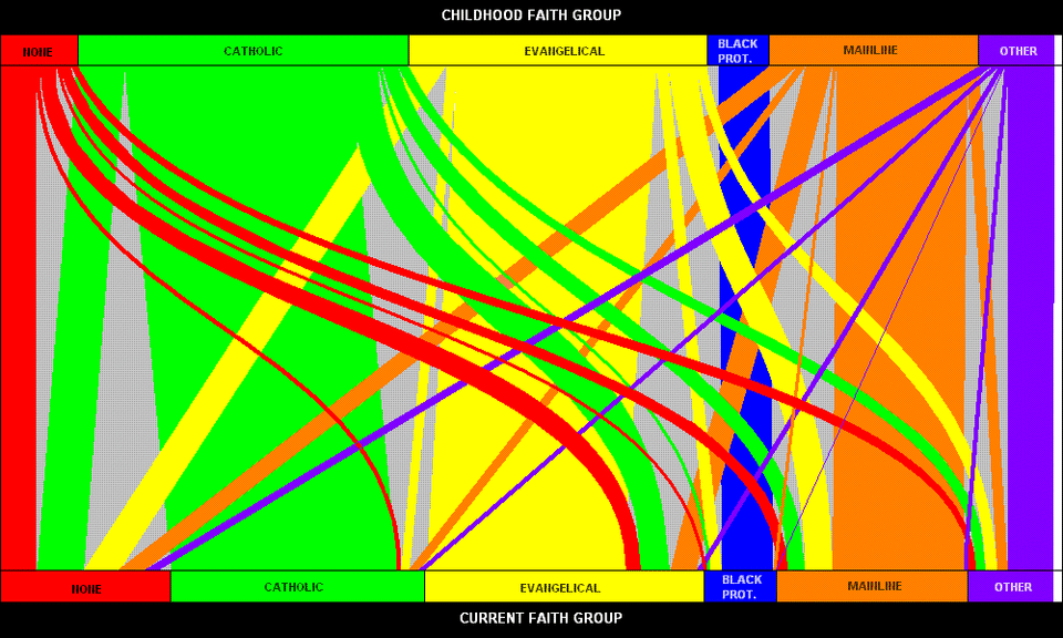
Color The cross-hairs of religions Long-time reader Nick B. found this attractive flow chart. The chart
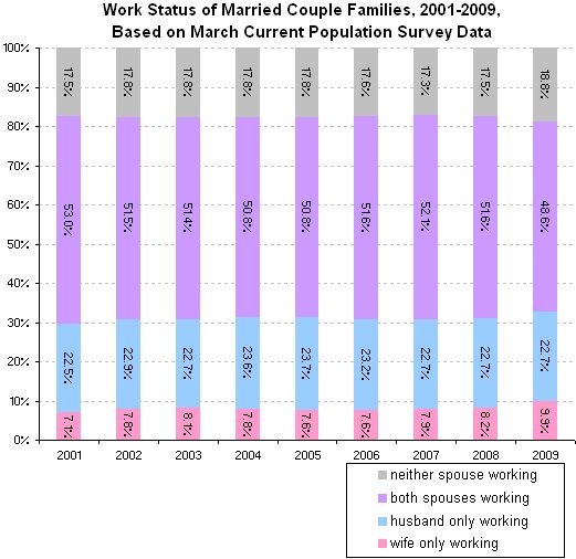
Axis Definitely not working Catherine Rampell ponticificated on the nature of working families in the NYT