Junk Charts
  • About
  • RSS
  • Posts by Year
  • Posts by Keywords
Sign in Subscribe

data visualization

Do you want a taste of the new hurricane cone?
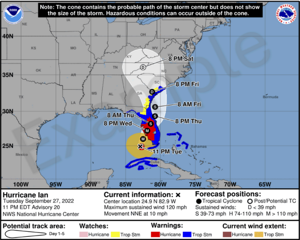
Aggregation

Do you want a taste of the new hurricane cone?

The National Hurricane Center (NHC) put out a press release (link to
Read More
The cult of raw unadjusted data
Data

The cult of raw unadjusted data

Kaiser looks at a chart that supposedly says nothing.
Read More
To a new year of pleasant surprises
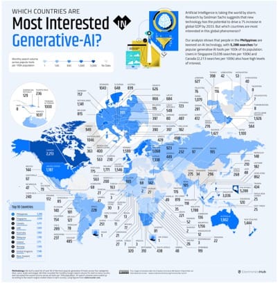
Business

To a new year of pleasant surprises

Kaiser finds a noisy map of the AI space. Happy new year!
Read More
Equal-area histograms
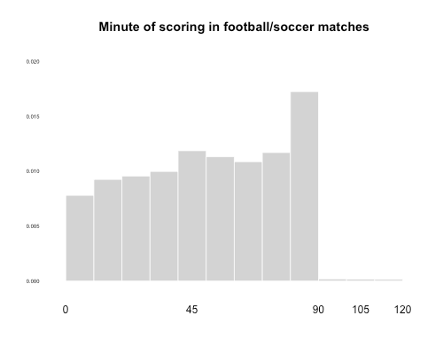
histogram

Equal-area histograms

Kaiser explores a variant of the histogram for plotting data distributions.
Read More
Do better
Covid-19

Do better

Kaiser reads some misleading NEJM data graphics.
Read More
Twin peaks: an energetic exploration
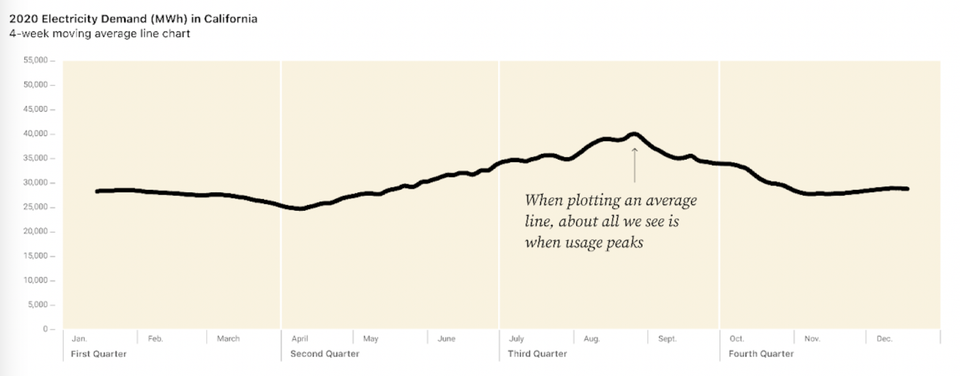
Aggregation

Twin peaks: an energetic exploration

Kaiser reads a blog post about visual exploration of energy consumption data.
Read More
← Newer Posts Page 5 of 7 Older Posts →
Junk Charts © 2026
  • BOOKS
  • COURSES
  • PRESS
  • CONSULTING
  • COACHING
  • CONTACT
Powered by Ghost