Aggregation Digital revolution in China: two visual takes Kaiser Fung, founder of JunkCharts and Principal Analytics Prep, discusses a map in the Economist about the digital silk road in China. What's the story?
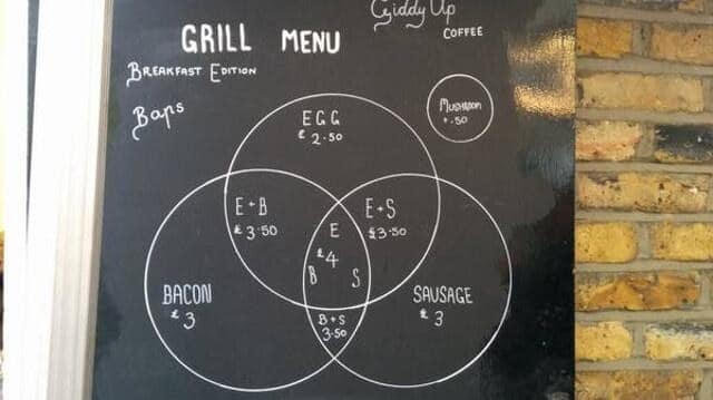
Food Foodies say, add dataviz spice please Kaiser Fung, founder of Junk Charts and Principal Analytics Prep, explains why the Venn diagram is not easy to read, and discusses some nice interesting food and beverage menus.
Bar chart Excel is the graveyard of charts, no! Kaiser Fung, creator of Junk Charts blog and founder of Principal Analytics Prep, encourages Excel users to work harder at making nice data graphics.
Axis Another simple Excel chart needs help Kaiser Fung, founder of Principal Analytics Prep and Junk Charts, takes apart an Elon Musk chart, created using some Excel defaults.
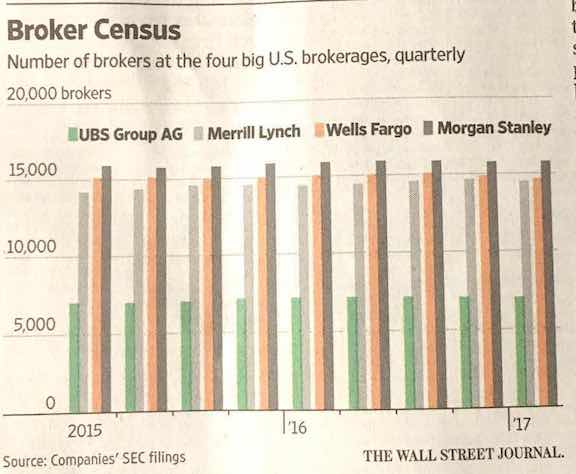
Axis Making people jump over hoops Kaiser Fung, founder of Principal Analytics Prep and Junk Charts, comments on a WSJ chart about how banks pay their brokers
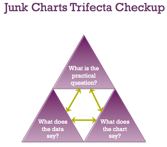
trifecta checkup Junk Charts Trifecta Checkup: The Definitive Guide Kaiser Fung, from Junk Charts, explains the data visualization framework known as the Trifecta Checkup, used to conceptualize and critique data graphics and charts.