Junk Charts
  • About
  • RSS
  • Posts by Year
  • Posts by Keywords
Sign in Subscribe

data visualization

Do better
Covid-19

Do better

Kaiser reads some misleading NEJM data graphics.
Read More
Twin peaks: an energetic exploration
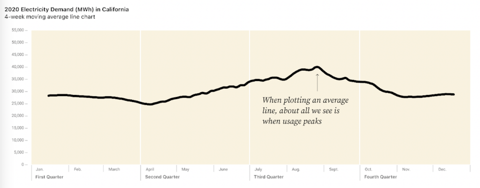
Aggregation

Twin peaks: an energetic exploration

Kaiser reads a blog post about visual exploration of energy consumption data.
Read More
To explain or to eliminate, that is the question
ray vella

To explain or to eliminate, that is the question

Reviewing some student projects
Read More
Two commendable student projects, showing different standards of beauty
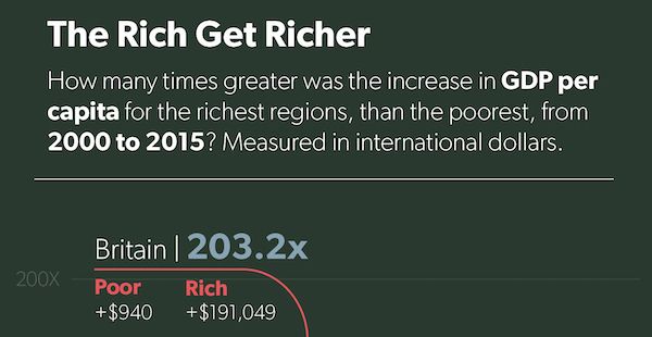
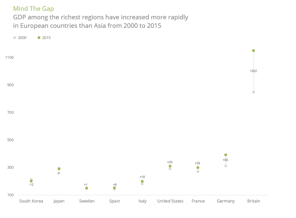
ray vella

Two commendable student projects, showing different standards of beauty

Kaiser discusses two dataviz projects by NYU students.
Read More
Vaccine researchers discard the start-at-zero rule
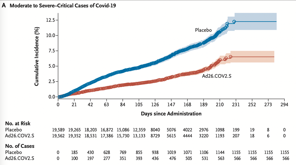
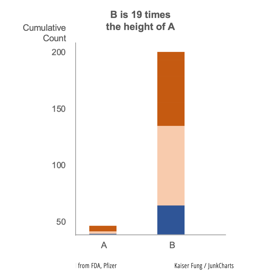
Axis

Vaccine researchers discard the start-at-zero rule

Kaiser revisits the practice of manipulating the vertical axis of a column chart.
Read More
Bloomberg made me digest these graphics slowly
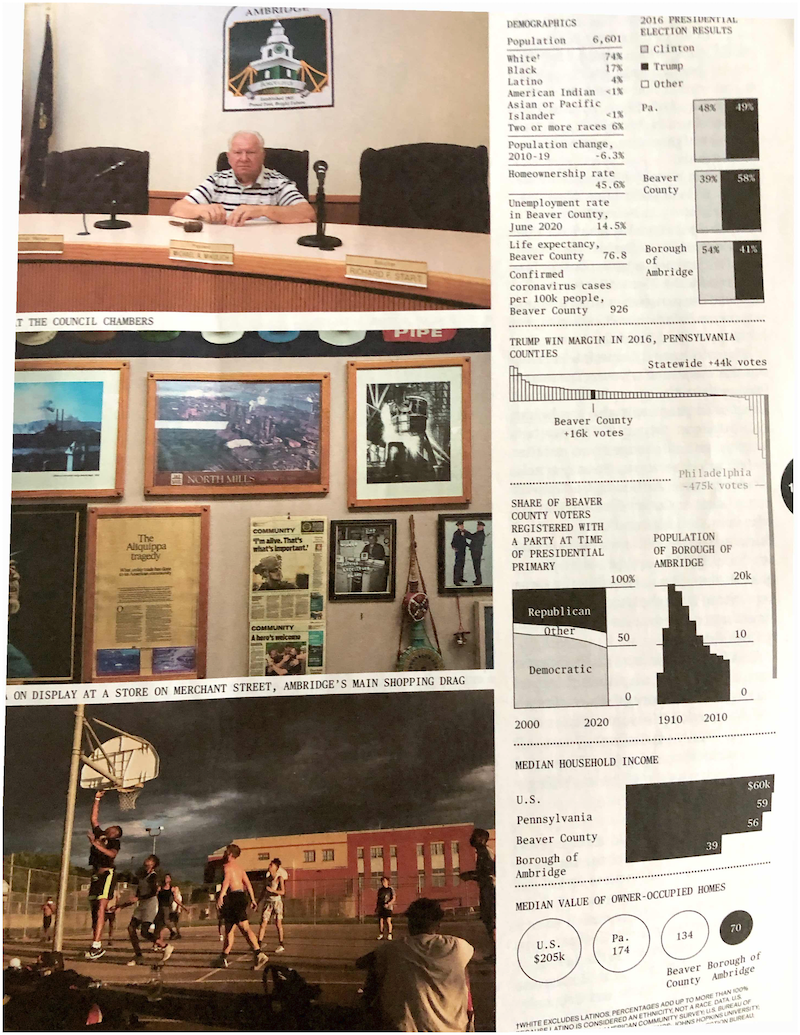
return on effort

Bloomberg made me digest these graphics slowly

Kaiser enjoys reading the graphics in the Businessweek issue on elections.
Read More
← Newer Posts Page 7 of 9 Older Posts →
Junk Charts © 2026
  • BOOKS
  • COURSES
  • PRESS
  • CONSULTING
  • COACHING
  • CONTACT
Powered by Ghost