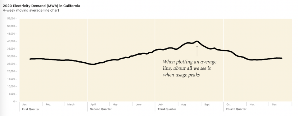
Aggregation Twin peaks: an energetic exploration Kaiser reads a blog post about visual exploration of energy consumption data.
Aggregation Open questions of the pandemic, part 2 Kaiser continues to discuss open questions of the pandemic, including questions raised by a recent White House graphic.
Aggregation Digital revolution in China: two visual takes Kaiser Fung, founder of JunkCharts and Principal Analytics Prep, discusses a map in the Economist about the digital silk road in China. What's the story?
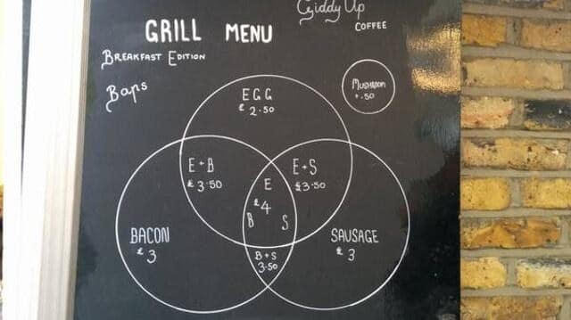
Food Foodies say, add dataviz spice please Kaiser Fung, founder of Junk Charts and Principal Analytics Prep, explains why the Venn diagram is not easy to read, and discusses some nice interesting food and beverage menus.
Bar chart Excel is the graveyard of charts, no! Kaiser Fung, creator of Junk Charts blog and founder of Principal Analytics Prep, encourages Excel users to work harder at making nice data graphics.