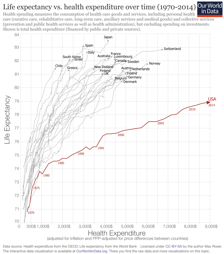
Axis Much more to do after selecting a chart form I sketched out this blog post right before the Superbowl - and
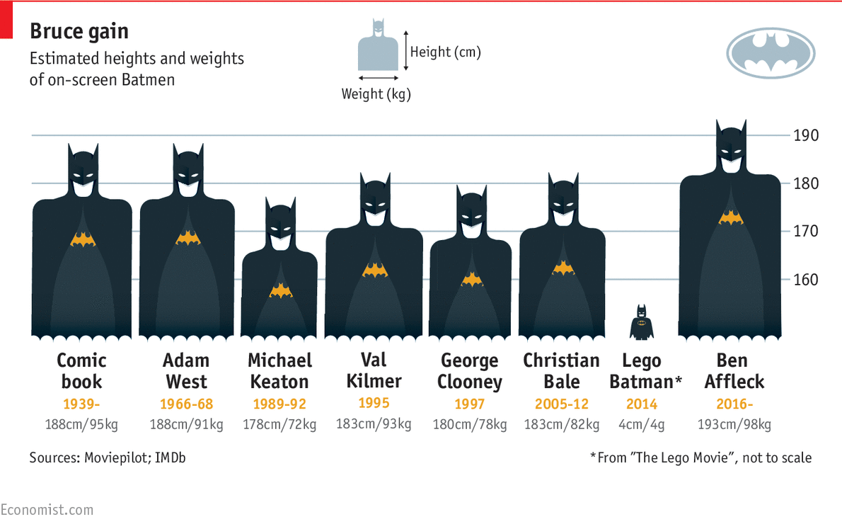
Aggregation Depicting imbalance, straying from the standard chart My friend Tonny M. sent me a tip to two pretty nice
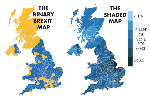
Aggregation Brexit, Bremain, the world did not end so dataviz people can throw shade and color Pick your own distortion
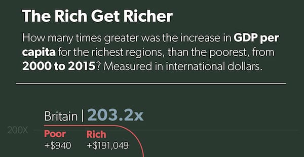
Axis How to print cash, graphically Twitter user @glennrice called out a "journalist" for producing the