Junk Charts
  • About
  • RSS
  • Posts by Year
  • Posts by Keywords
Sign in Subscribe

Dot plot

The most dangerous day
Aggregation

The most dangerous day

The most dangerous day in one's life
Read More
Making colors and groups come alive
Bar chart

Making colors and groups come alive

How to use color effectively in a dataviz
Read More
Reading log: HBR's specialty bar charts
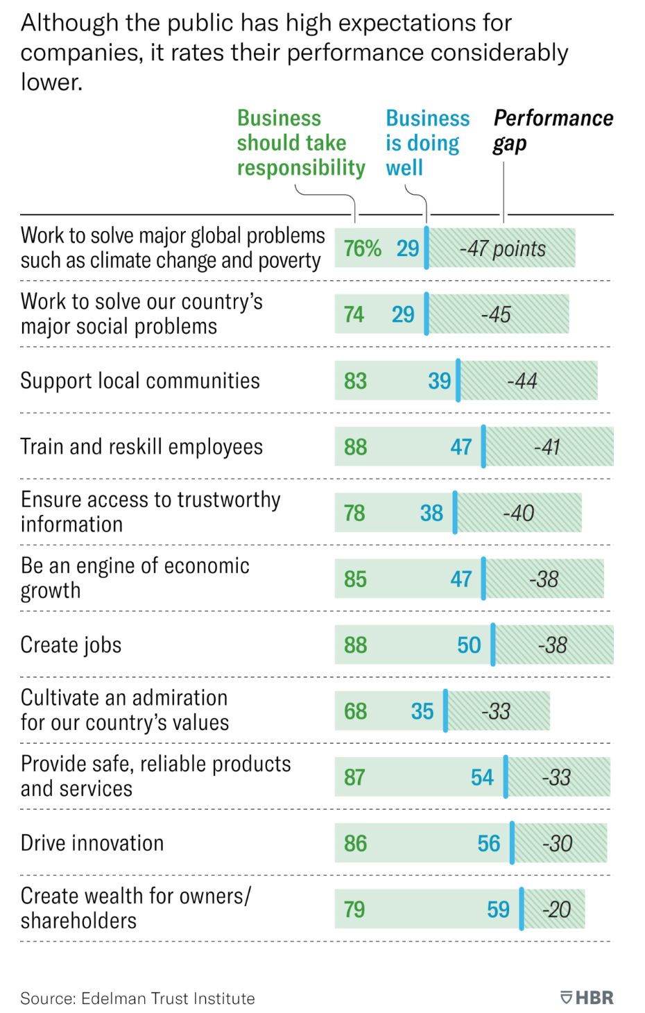
Bar chart

Reading log: HBR's specialty bar charts

Today, I want to talk about a type of analysis that I
Read More
A nice plot of densities, but what's behind the colors?
density

A nice plot of densities, but what's behind the colors?

Kaiser is intrigued by a plot of densities.
Read More
The cult of raw unadjusted data
Data

The cult of raw unadjusted data

Kaiser looks at a chart that supposedly says nothing.
Read More
Two commendable student projects, showing different standards of beauty
ray vella

Two commendable student projects, showing different standards of beauty

Kaiser discusses two dataviz projects by NYU students.
Read More
← Newer Posts Page 2 of 6 Older Posts →
Junk Charts © 2025
  • BOOKS
  • COURSES
  • PRESS
  • CONSULTING
  • COACHING
  • CONTACT
Powered by Ghost