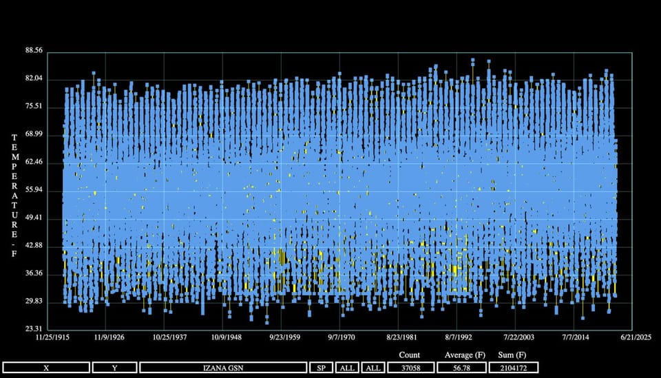
density A nice plot of densities, but what's behind the colors? Kaiser is intrigued by a plot of densities.
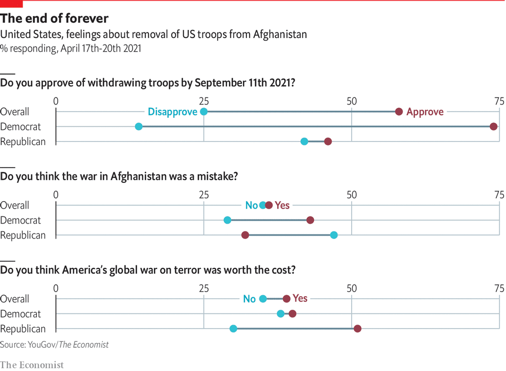
return on effort Reading this chart won't take as long as withdrawing troops from Afghanistan Kaiser deciphers a chart showing Americans' response to Biden's decision to withdraw troops from Afghanistan.
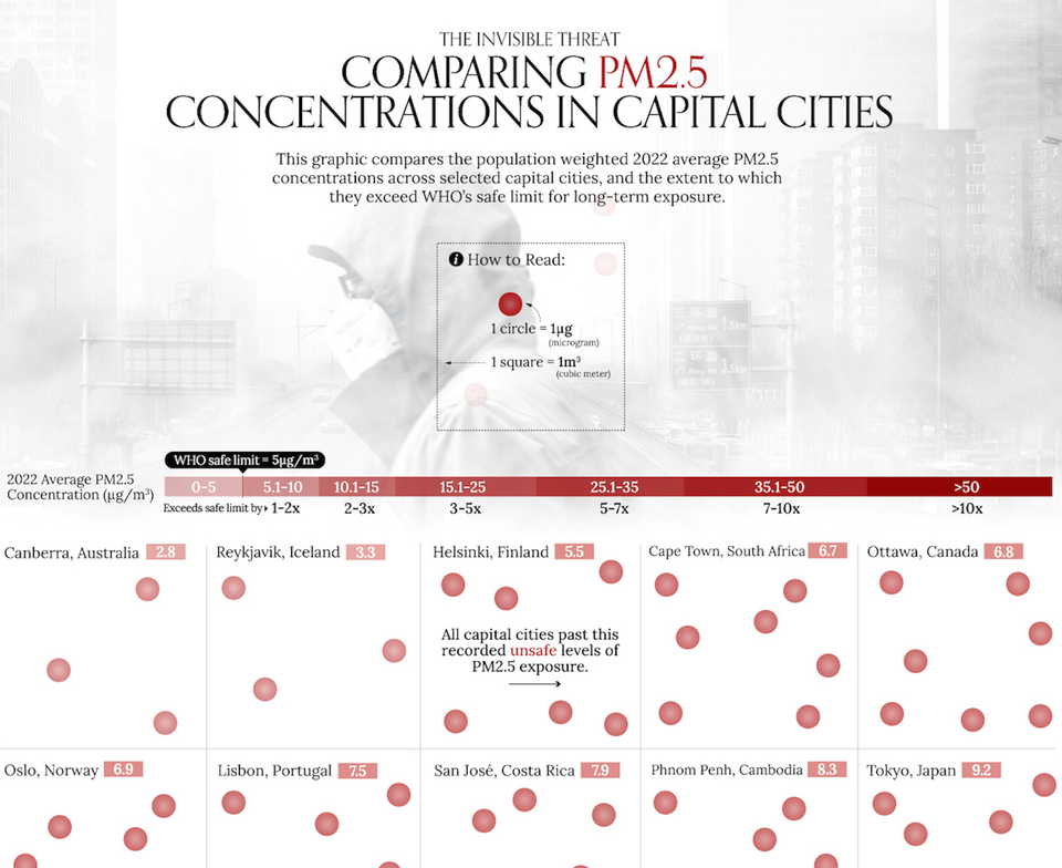
ray vella Two commendable student projects, showing different standards of beauty Kaiser discusses two dataviz projects by NYU students.
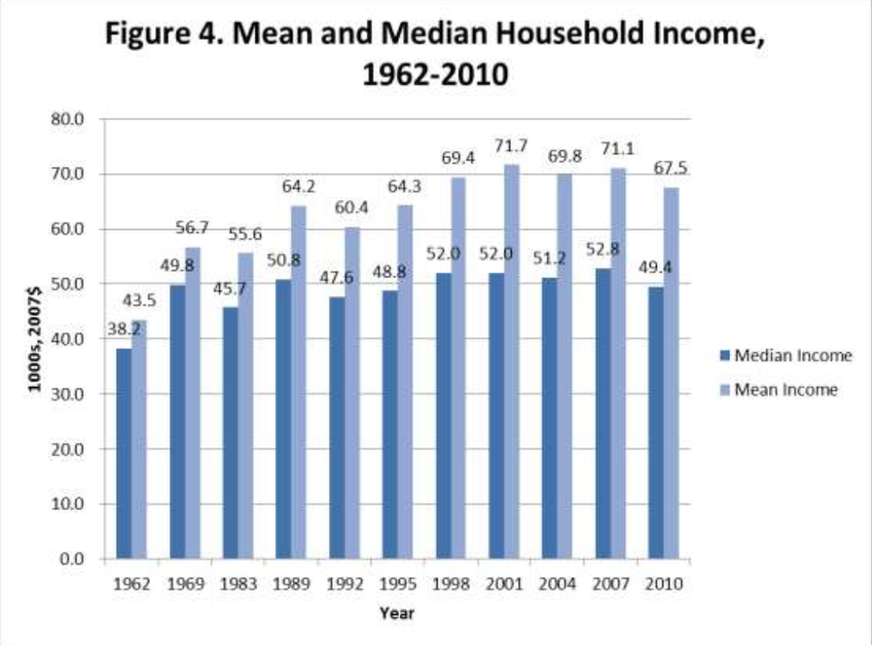
Bar chart Excel is the graveyard of charts, no! Kaiser Fung, creator of Junk Charts blog and founder of Principal Analytics Prep, encourages Excel users to work harder at making nice data graphics.