Junk Charts
  • About
  • RSS
  • Posts by Year
  • Posts by Keywords
Sign in Subscribe

Dot plot

How effective visualization brings data alive
Aggregation

How effective visualization brings data alive

Bringing data alive
Read More
Reader's indigestion
Aggregation

Reader's indigestion

Reader Chris B. pointed us to this unfortunate chart, based on a
Read More
Auditory aid
Dot plot

Auditory aid

This effort by the NYT graphics team is breath-taking. They use
Read More
See what I mean
Axis

See what I mean

Andrew Sullivan said that the Rasmussen poll has been disconcordant with other
Read More
See what I mean
Axis

See what I mean

Andrew Sullivan said that the Rasmussen poll has been disconcordant with other
Read More
Following one's nose 1
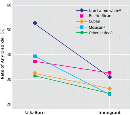
Aggregation

Following one's nose 1

Andrew Gelman has a great post about a so-called Immigrant paradox
Read More
← Newer Posts Page 5 of 7 Older Posts →
Junk Charts © 2026
  • BOOKS
  • COURSES
  • PRESS
  • CONSULTING
  • COACHING
  • CONTACT
Powered by Ghost