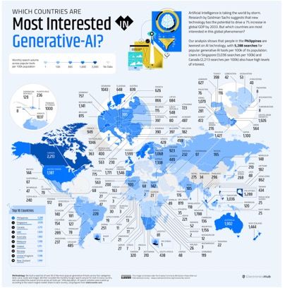
Business To a new year of pleasant surprises Kaiser finds a noisy map of the AI space. Happy new year!
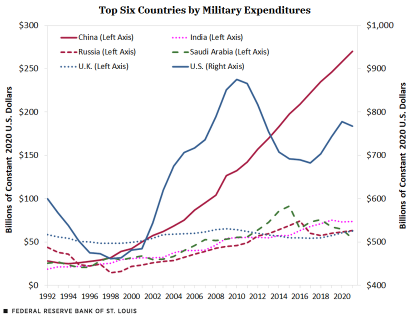
dual axes Dual axes: a favorite of tricksters Kaiser comes across a quintessential example of using dual axes with intent to mislead.
Analytics-business interaction Self-checkout takes another hit Kaiser notes that some retailers are finally admitting the true cost of self-checkout technology.
ray vella Selecting the right analysis plan is the first step to good dataviz Kaiser shows how the data analysis plan impacts dataviz success
Assumptions Open questions of the pandemic, part 1 Kaiser discusses some open questions of the Covid-19 pandemic