Junk Charts
  • About
  • RSS
  • Posts by Year
  • Posts by Keywords
Sign in Subscribe

Food

Foodies say, add dataviz spice please
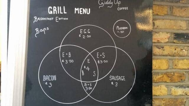
Food

Foodies say, add dataviz spice please

Kaiser Fung, founder of Junk Charts and Principal Analytics Prep, explains why the Venn diagram is not easy to read, and discusses some nice interesting food and beverage menus.
Read More
GMO labeling is good science
Food

GMO labeling is good science

The movement to stop GMO labels
Read More
Small multiples with simple axes
Small multiples

Small multiples with simple axes

All the things they did well
Read More
No use crying over 2% milk
Food

No use crying over 2% milk

image from http://lulzshirts.com/Last week, I had dinner with my
Read More
Cause-effect

Cutting data won't make cutting weight easier

In my new book, I have a chapter on interpreting the statistics
Read More
Which software is responsible for this?
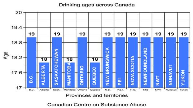
Axis

Which software is responsible for this?

@guitarzan wants us to see this chart from north of the border,
Read More
← Newer Posts Page 4 of 7 Older Posts →
Junk Charts © 2026
  • BOOKS
  • COURSES
  • PRESS
  • CONSULTING
  • COACHING
  • CONTACT
Powered by Ghost