Junk Charts
About
RSS
Posts by Year
Posts by Keywords
Sign in
Subscribe
Gridlines
radar chart
Four reasons to unplug radar charts
Ouch, ouch, ouch, ouch
sports analytics
Visualizing hierarchies
Bonus: setting gridlines on a circular chart
Aggregation
Don't show everything
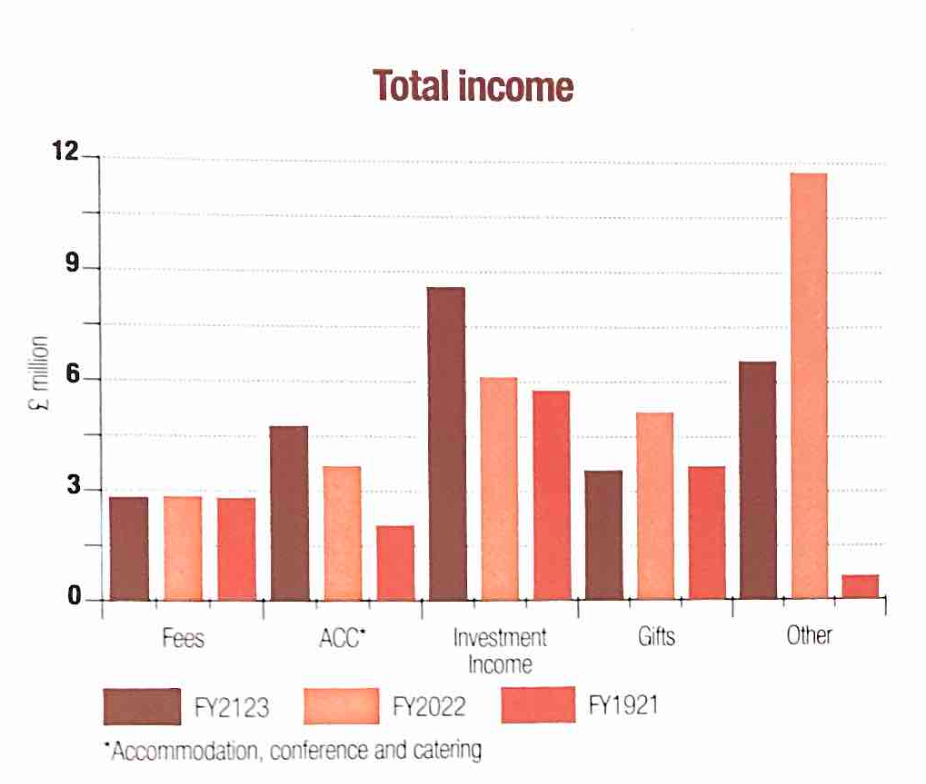
Plotting lots of data but conveying not much information
Bar chart
Dizziness
Dizziness is probably not an intended goal of charting
Bar chart
Tidying up the details
Fixing up little details on a data graphic pays dividends
Bar chart
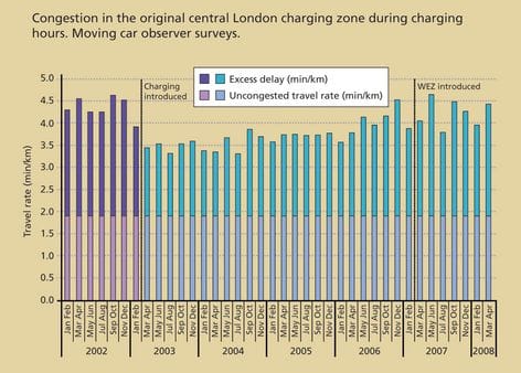
Excess delay
Kaiser finds a chart that analyzes London's congestion charging programme.
Page 1 of 4
Older Posts
→