Junk Charts
  • About
  • RSS
  • Posts by Year
  • Posts by Keywords
Sign in Subscribe

Infographics

Avinash's scoring rubric for data visualization
data visualization

Avinash's scoring rubric for data visualization

Eight ingredients of great graphics
Read More
Approaching the Paris Olympics
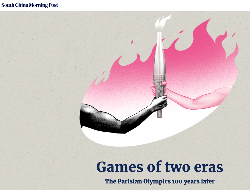
Current affairs

Approaching the Paris Olympics

SCMP impresses again with this infographics about the Paris Olympics
Read More
Selecting the right analysis plan is the first step to good dataviz
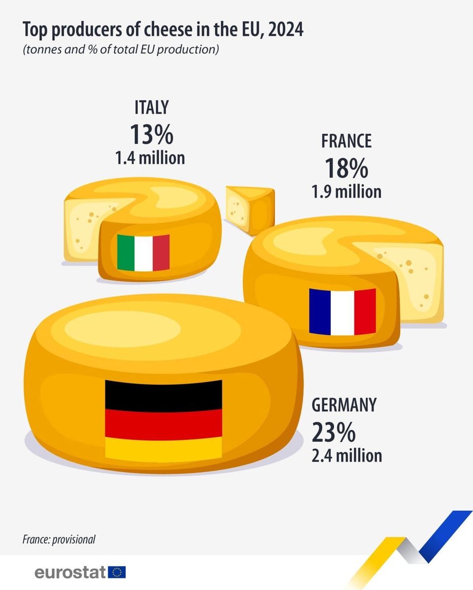
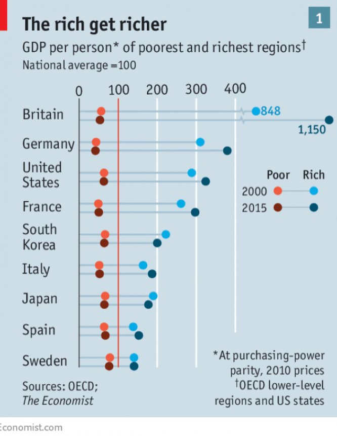
ray vella

Selecting the right analysis plan is the first step to good dataviz

Kaiser shows how the data analysis plan impacts dataviz success
Read More
To explain or to eliminate, that is the question
ray vella

To explain or to eliminate, that is the question

Reviewing some student projects
Read More
Displaying convoluted indices
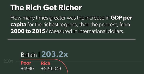
ray vella

Displaying convoluted indices

Kaiser shows how a small change in structure clarifies comparisons on a data visualization project.
Read More
Two commendable student projects, showing different standards of beauty
ray vella

Two commendable student projects, showing different standards of beauty

Kaiser discusses two dataviz projects by NYU students.
Read More
Page 1 of 4 Older Posts →
Junk Charts © 2025
  • BOOKS
  • COURSES
  • PRESS
  • CONSULTING
  • COACHING
  • CONTACT
Powered by Ghost