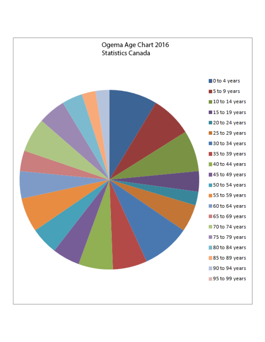
Pie chart Doing my duty on Pi Day #onelesspie Kaiser Fung, founder of Junk Charts and Principal Analytics Prep, celebrates Pi Day by remaking a pie chart from Wikipedia.
ray vella Diverging paths for rich and poor, infographically Reviewing a creative data visualization from Ray Vella's class
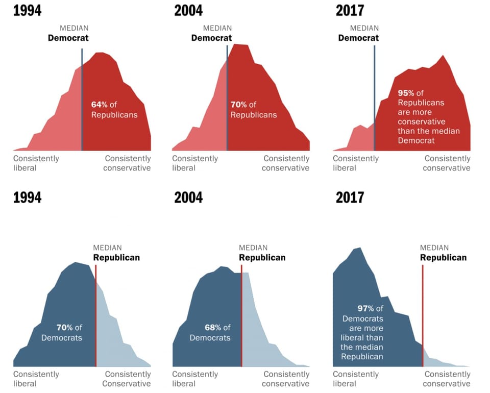
Area chart Let's not mix these polarized voters as the medians run away from one another In-depth look at Washington Post's fantastic feature on median U.S. voters
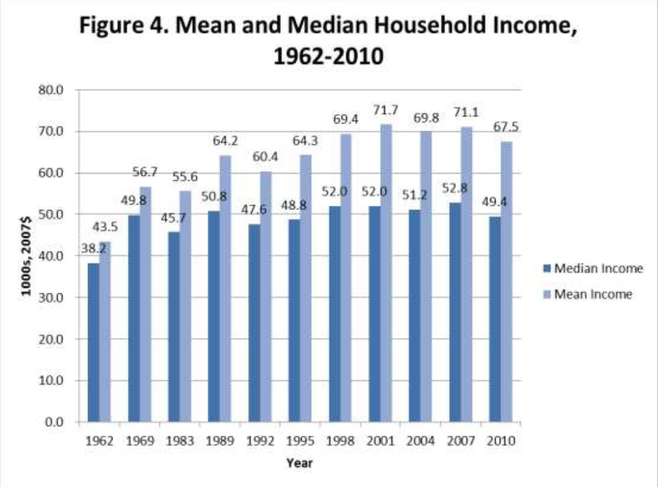
Bar chart Excel is the graveyard of charts, no! Kaiser Fung, creator of Junk Charts blog and founder of Principal Analytics Prep, encourages Excel users to work harder at making nice data graphics.
Algorithms If you are using Facebook Ads split testing (A/B testing), stop fooling yourself Kaiser Fung, founder of Principal Analytics Prep, and former director of Applied Analytics at Columbia University, explains why you can't run proper A/B tests on Facebook
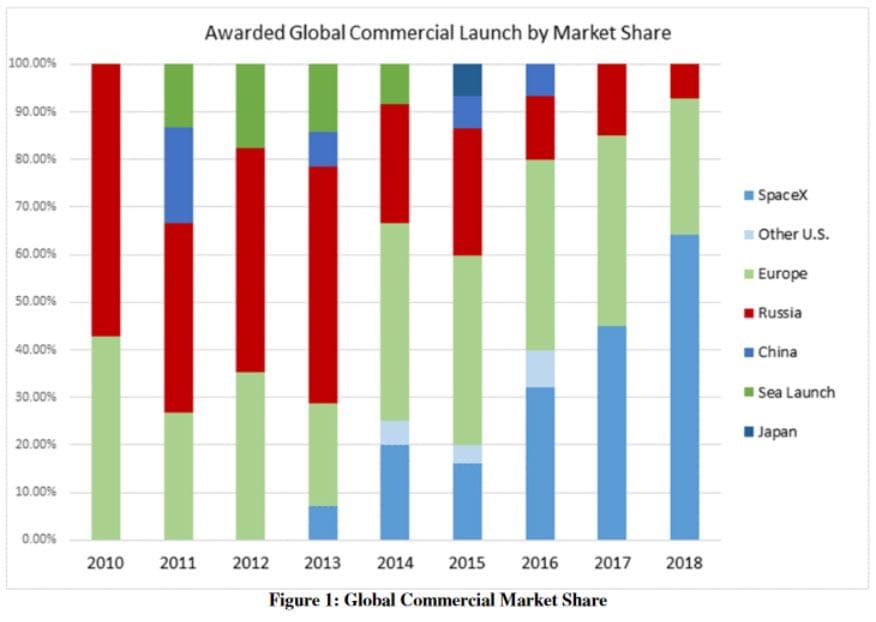
Axis Another simple Excel chart needs help Kaiser Fung, founder of Principal Analytics Prep and Junk Charts, takes apart an Elon Musk chart, created using some Excel defaults.